CityPup
Design Sprint
Day 1: Background
Puropse:
This project aims to help people living in large cities find the perfect puppy to adopt. This goal is reached by increasing the adoption rate, making owners happier, and finding forever homes for dogs. This project should be designed as a website or in a web app format that can be accessed through a laptop or a desktop.
Targeted Audience:
Some difficulties some individuals encounter during adoption are not getting delayed and consistent information about a dog when visiting shelters.
Key Features;
Since owning a dog is a long-term commitment, many seek basic information like breed, age, size, personality, trainability, and energy or activity level.
Trainability
Energy level
Personality
Breed
Age
Size
Emphasizing on visuals
(Photos & Video)
Day 2: Research
Competitive Analysis
This project aims to help people living in large cities find the perfect puppy to adopt. This goal is reached by increasing the adoption rate, making owners happier, and finding forever homes for dogs. This project should be designed as a website or in a web app format that can be accessed through a laptop or a desktop.
Ideation
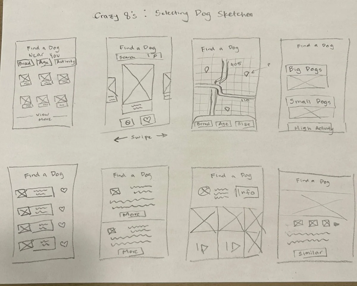
Goal: Create screens that make it easy for users to browse the selection of dogs
Significant Features
One of the screens created displayed multiple dog selections.
A sliding gallery that shows the profile of the intended dog.
An option for users to save or like a selected dog.
A map of where to find and adopt a specific dog.
Crazy 8: Is an exercise to enhance the brainstorming process by quickly jotting down potential ideas within a specific time frame
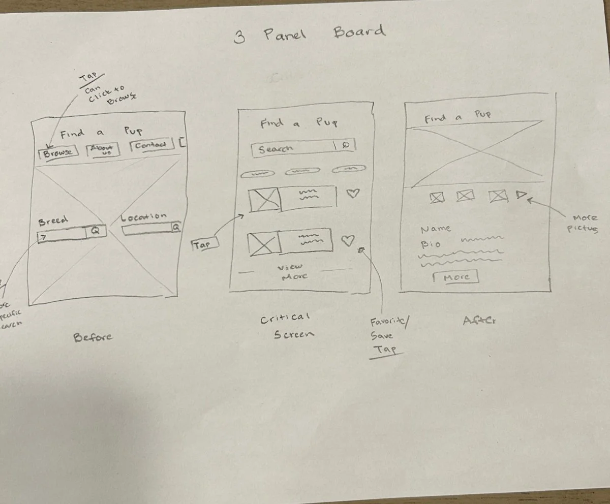
Constructing a 3 Pannel Board allows me to choose a solution screen while also creating screens that come before and after the solution
Solution
After completing the crazy 8, I addressed a critical screen many users would encounter. This screen displays available product cards for various dogs. I then designed two other screens that users can access directly before and after
First Screen
Navigation Bar
About, Contact, & Browse
Search Bar
Second Screen
It is accessed when the user clicks on the dog’s profile.
Bio, Pictures, & Videos
CTA buttons that expand to more information
Temperament
Health Status
Activity Level
Critical Screens addressed the needs of what users look for before adopting
Day 3: Ideate
Approach
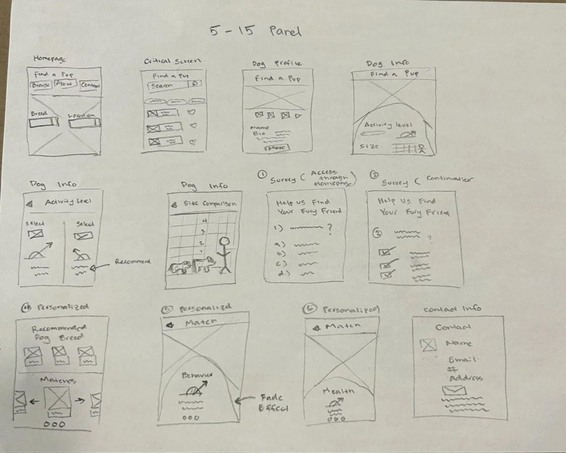
During this day, I decided which slides, I wanted to incorporate into my prototype.
A sleek homepage that allows users to browse easily.
A search bar to enable the users to quickly locate a dog.
A browse section to address individuals who are not looking for a specific dog.
Laying out screens in this format allows me to visualize different user flow.
Solution:
I incorporated screens that helped users compare the size, activity level, and temperament. Although the description is helpful, our users wanted photos and videos of the dog, which gives the website more credibility. To emphasize customer satisfaction, I incorporated a survey to help match owners with their dogs to ensure the right fit for individuals. Lastly, I incorporated a screen to help individuals get in contact as easily and seamlessly as possible.
Designing for Users Needs
Users want a product that makes them feel comfortable purchasing. They want a dog that fits their place and lifestyle. They expressed that photos and videos improve the credibility of the product.
Day 4: Prototype
Approach
Userflow1: Searching/ Basic info
Feature
Easily select a dog
Providing valuable information
provide features that alow the users to backtrack or undo an action
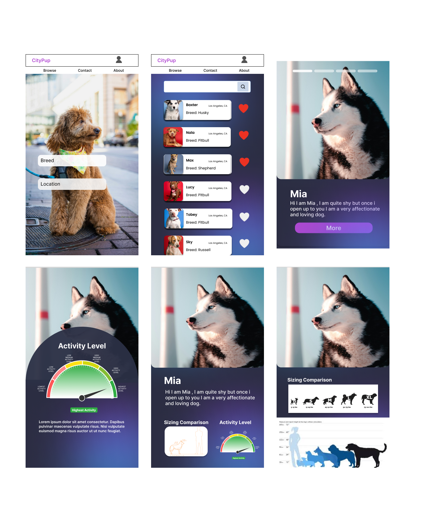
Both breeds and locations are highlighted on the homepage. Within the browse section, a save button is provided.
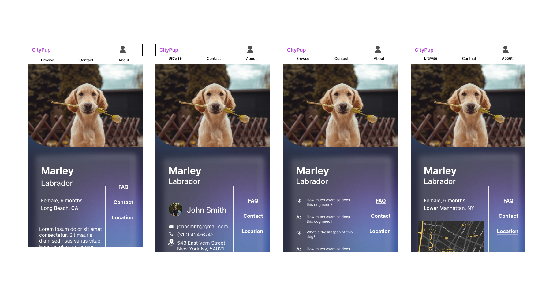
The following screen displays a dog’s profile. (This includes Bio, Activity Level, & Size)
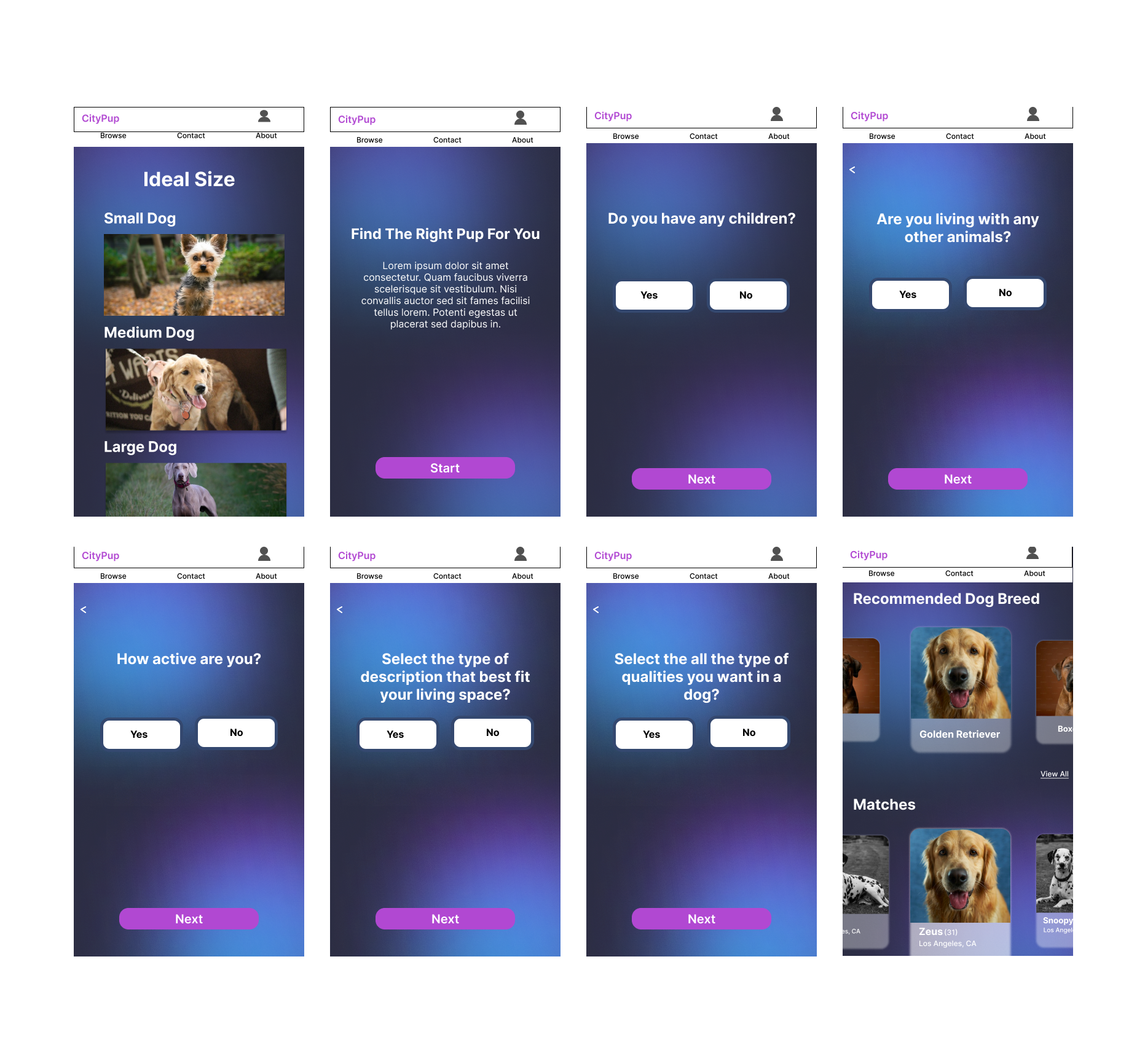
Userflow2: Pairing Quiz
If a user is unsure of what type of dog fits their home or lifestyle, they are given the option to take a test that would help them match to their ideal dog.
The screens display a series of questions that ask about the users’ living space, activity level, and ideal size.
Userflow2: Pairing Quiz
The set screens displayed above provide the user with different subsections that help them learn more about the dog. Basic information such as the FAQ, contact, and location are all provided to help the user make an informed decision.
During this design sprint, I quickly designed a prototype with the bare minimum essentials. Once this prototype was created, I could test the product’s functionality. My goal for testing the prototype is to see how easily a user can select a dog close to their proximity. I wanted to learn what make stop an individuals process of adopting a puppy. I would also like to know what other information users seek to make them comfortable getting a puppy. At the end of this process, I saw how users might interact with the product and if they can efficiently complete specific tasks.
Day 5: Validate
Qualification for Testing
All three participants found their dog online.
familiar with similar products
Participants were selected from families and friends
Their experiences had to differ from one another
(ie: Breed, Lifestyle, and Living Space)
Participants
Joseph O. , Matt A. , Tim G
Challenges with Testing
Filtering out the appropriate audience.
The time constraint hindered my ability to choose the ideal candidate for the usability test.
I restored to family and friends for my testing. Ideally, I would have chosen individuals that I would have no connections, reducing the amount of bias.
Before creating a high-fidelity prototype, I used a paper prototype that utilized screenshots to conduct my usability testing.
During the test, the participant misinterpreted one of my sketches and required clarification
Reflection
Results from the Usability Testing
Findings: Issues with the navigation. The contact button’s ambiguity made users uncertain whether it provided information about the company or its partners.
Proposal: A suggestion was to add a hover feature for instant access to contact details for the company and affiliated shelters.
Findings: The About section lacked clarity regarding its purpose.
Proposal: We propose adding a dropdown detailing the company’s mission and vision to enhance credibility
Findings: Low interaction with the “more” button on the dog profile was noted as an issue.
Proposal: Consolidating all information onto one page instead of requiring users to click for details might improve engagement.
Other Recommendation
Other Recommendation: Adding a form for serious inquiries to streamline the application process. To reduce confusion, renaming the “Match” section to “ Match with your ideal dog” was recommended. Adding a FAQ section on the homepage could also aid first-time users.
Next Steps
Since this was a design sprint, I waslimited by a time constraint. If given more time, I would proceed to reiterate the product based off of the users feedback before retesting, the product.


