GolfGuru
Background
“Up to 50% of users open, on average, 7 items per page but soon abandon them without placing any products within their cart”
What’s the Problem
With countless online users surfing the web to browse and purchase products, it is no surprise that many companies hire specialized individuals to design online products that enhance user experience. These individuals with these skills can create products that not only improve the amount of user retention but also increase the company’s revenue.
Addressing the issue!
Hypothesis
A low conversion rate could occur when users don’t know which product to purchase. User abandonment also occurs when users are asked to create an account to purchase
Company Managers’ hypothesis:
Overwhelming amount of displayed products
Extensive onboarding process
Why?
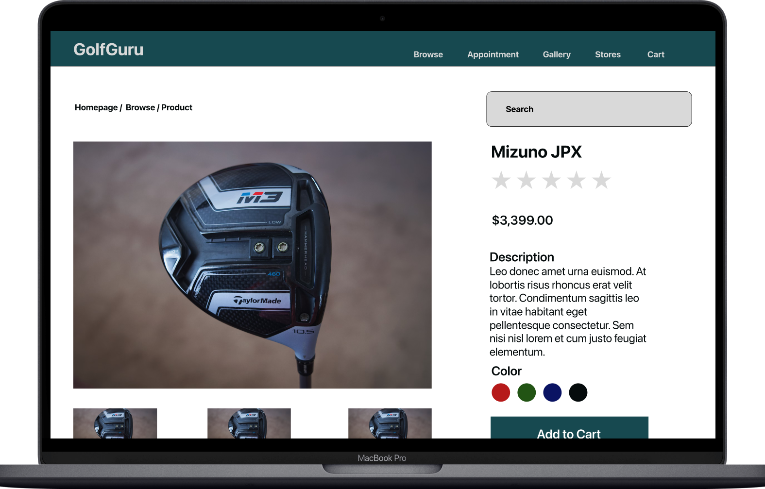
GolfGuru is an e-commerce website that sells golf- related products and services. This company is experiencing a decrease in sales due to low conversion rates from browsing to checking out. The company utilized UI/UX designers who incorporated changes to the browsing and checking at section
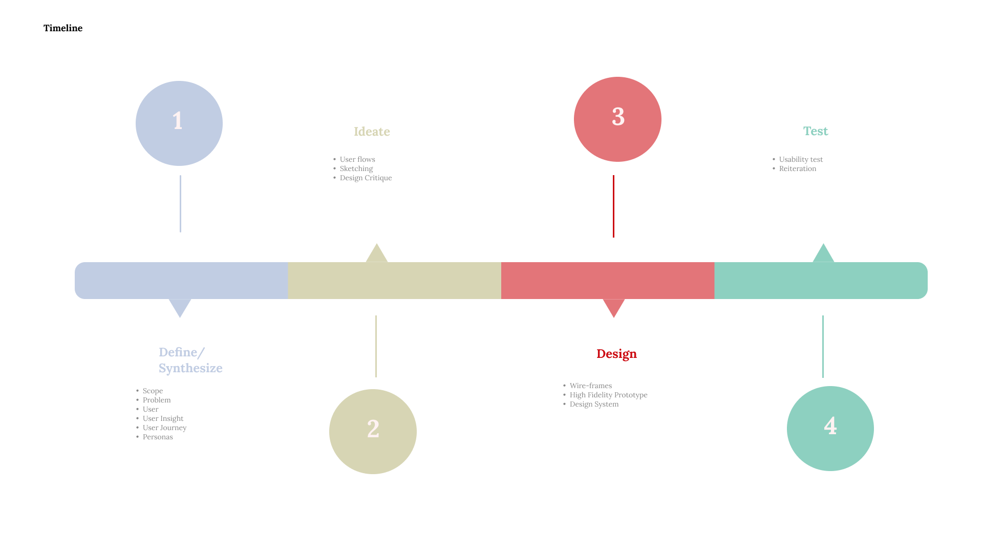
Timeline
Research
Drawing Inspiration
Competitive analysis helps designers to draw inspiration for the end product.
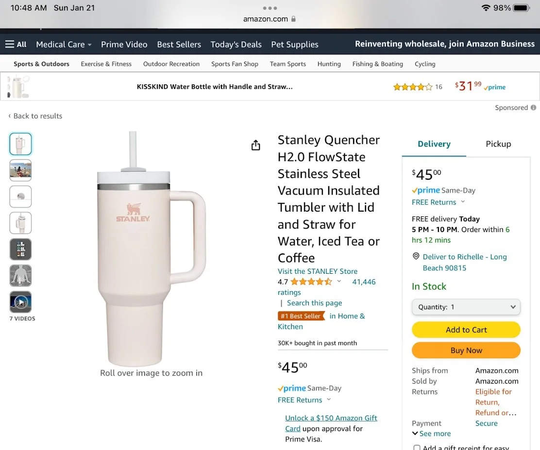
Amazon
One of the largest companies. Has countless amount of users each day. Has a high conversion rate.
Strength
Simple yet effective navigation bar
Suggested Products
Reviews are scannable
Weakness
Needs to utilize more whitespace
Decrease amount of words to not overwhelm users
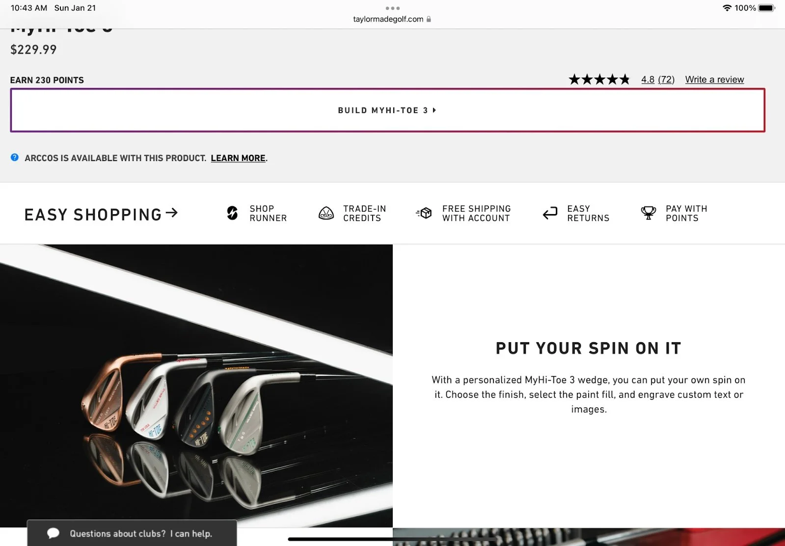
TaylorMade
A successful golf brand that many professionals on Golf Tours use. Has a big influence on the sport.
Strength
Ability to personalize clubs
Simplicity in the layout
Various amounts of image
Comparison and specification
Weakness
Should utilize company partners
Prioritize highlighting testimonies from professionals
Interview
Asking the Right Questions
How might we improve user retention?
How might we increase customer checkout?
How might we increase the company’s revenue?
How might we gamify the experience?
Key Insight
Want to feel confident with their purchase
Saving is a crucial factor
Implement a sizing chart
Low stock persuades more
Incorporating a guest checkout
FAQ section or a chatbox should be used
Breadcrumbs to help navigating
Process
Participants were co-workers who had various degrees of golfing knowledge. Through extensive interviews, I was able to gain helpful insight to improve the product.
This tool allowed me to brainstorm solutions by reframing my own perspectives while putting myself in the user’s mindset.
Empathy Map
User Flow
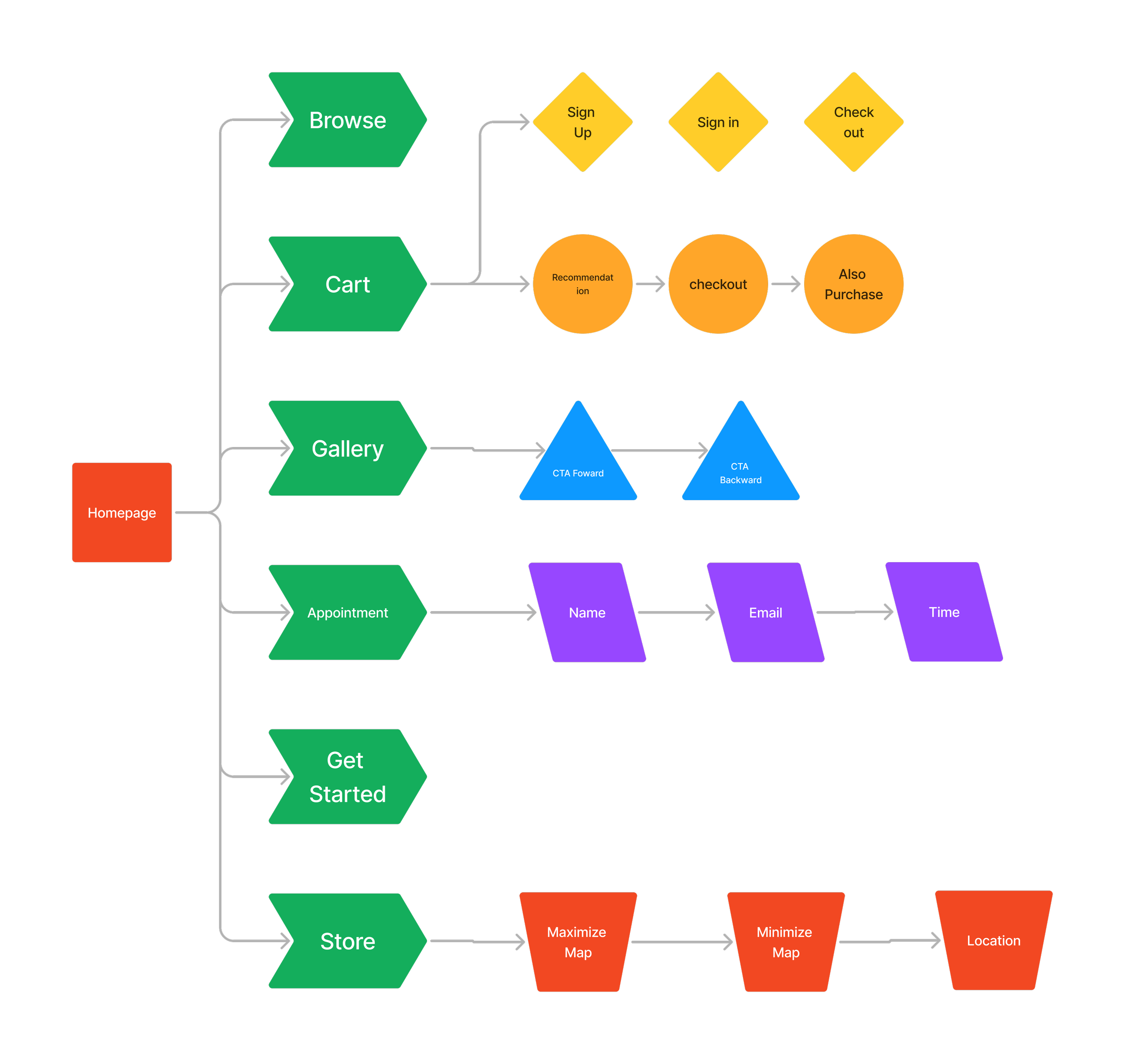
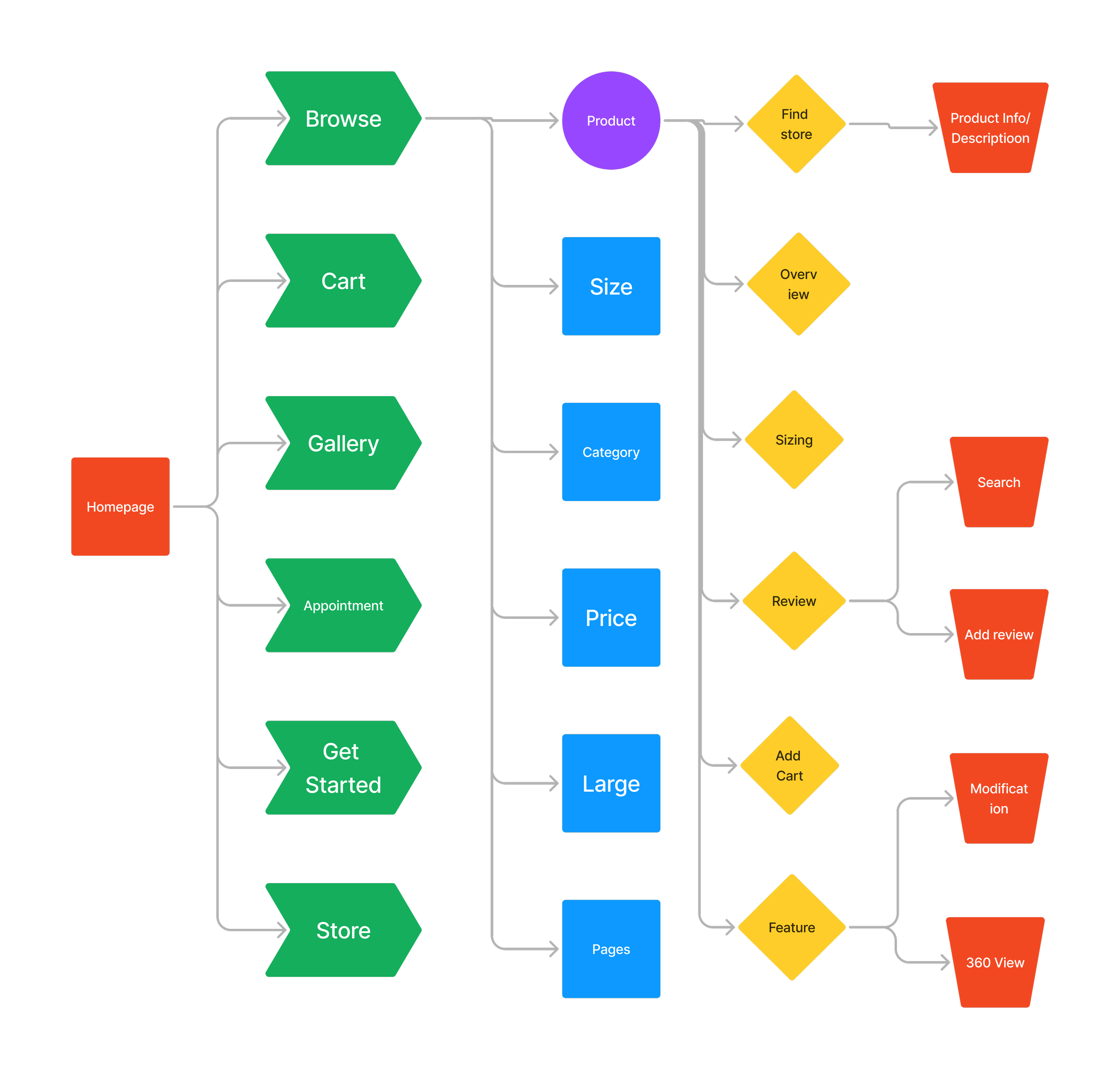
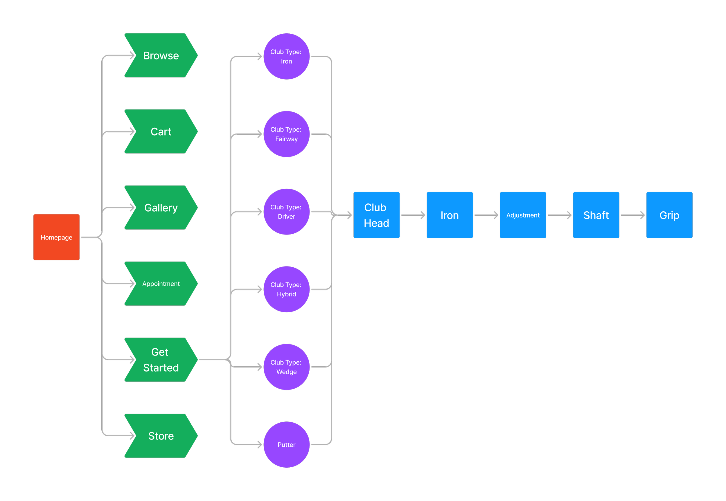
Goal: Information Architecture was designed in a way for users to navigate through the product easily.
These user flows focused on routes that allowed consumers to purchase, personalize, and checkout most efficiently and effectively. This tool allowed me to visualize the user journey while identifying pain that individuals may encounter.
User flow 1: Setting Appointment/Viewing Gallery/ Checkout
User flow 2: Browse Product/ Finding Store & Feature/ Review
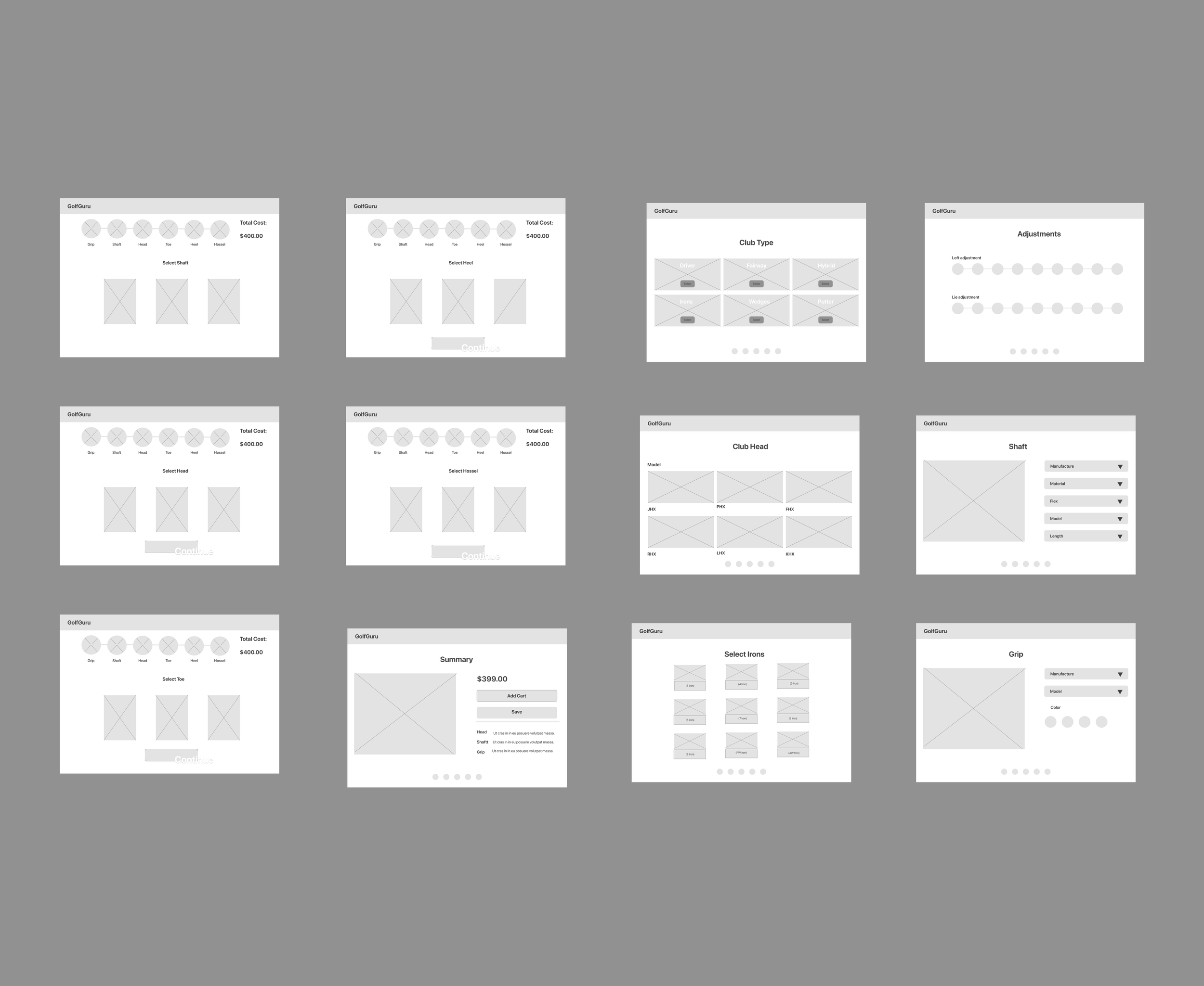
User flow 3: Personalizing a club
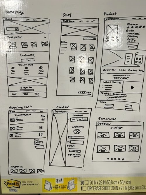
Sketches
Sketching helped create the foundation of the product. It was designed in a very conservative approach that provided a sense of familiarity to the users.
What was the thought process behind the sketches?
To create the most viable product in a short time that can be tested by targeted users.
These screens addressed some of the pain points addressed during the initial interview, such as navigation, checking out, and personalization
Key Features
Providing a Bestseller section on the homepage
Incorporating a filter section on the shop page
The navigation bar leads to the product, checkout, and personalized pages.
Six crucial screens laid the foundation of how the product would be laid out.Sketches
Sketching helped create the foundation of the product. It was designed in a very conservative approach that provided a sense of familiarity to the users.
What was the thought process behind the sketches?
To create the most viable product in a short time that can be tested by targeted users.
These screens addressed some of the pain points addressed during the initial interview, such as navigation, checking out, and personalization
Key Features
Bestseller section on the homepage
Filter section on the shop page
The navigation bar leads to the product, checkout, and personalized pages.
Six crucial screens laid the foundation of how the product would be laid out.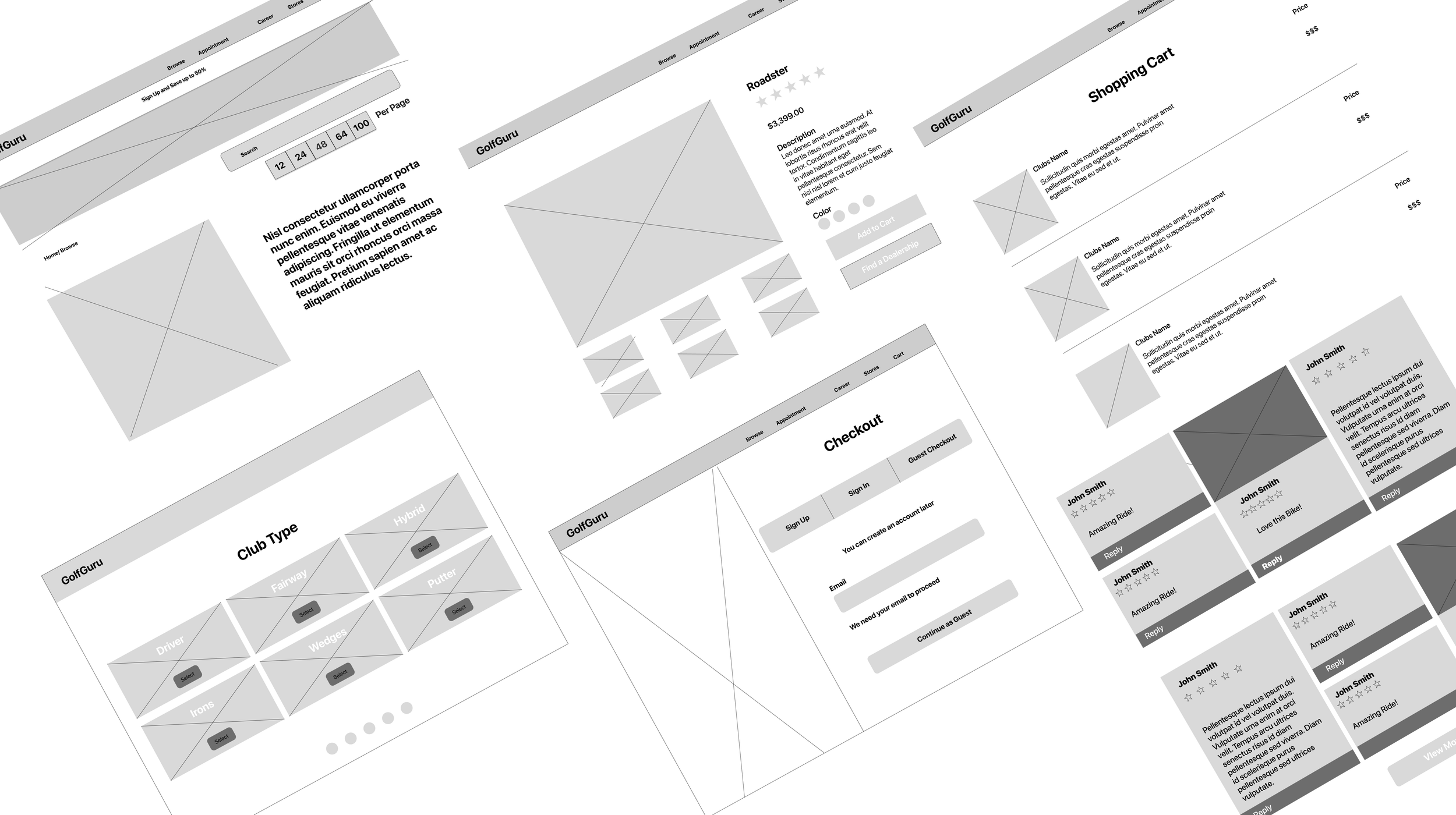
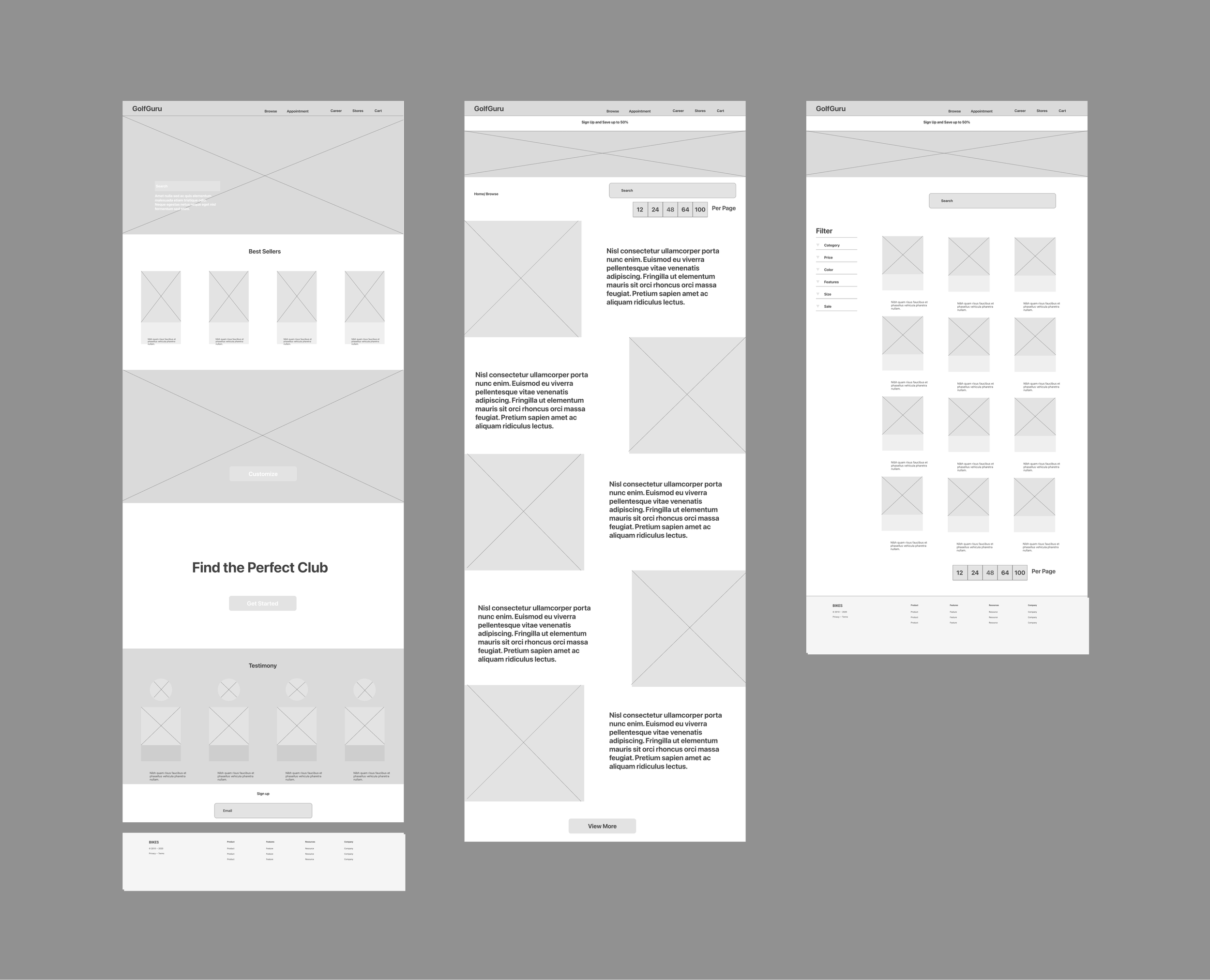
Low Fidelity-WireframesHome Page & Shop Page
Shop Page
Adding a product card
Purpose: Broad view of all the products
Filter section:
Narrow Search
Search Bar
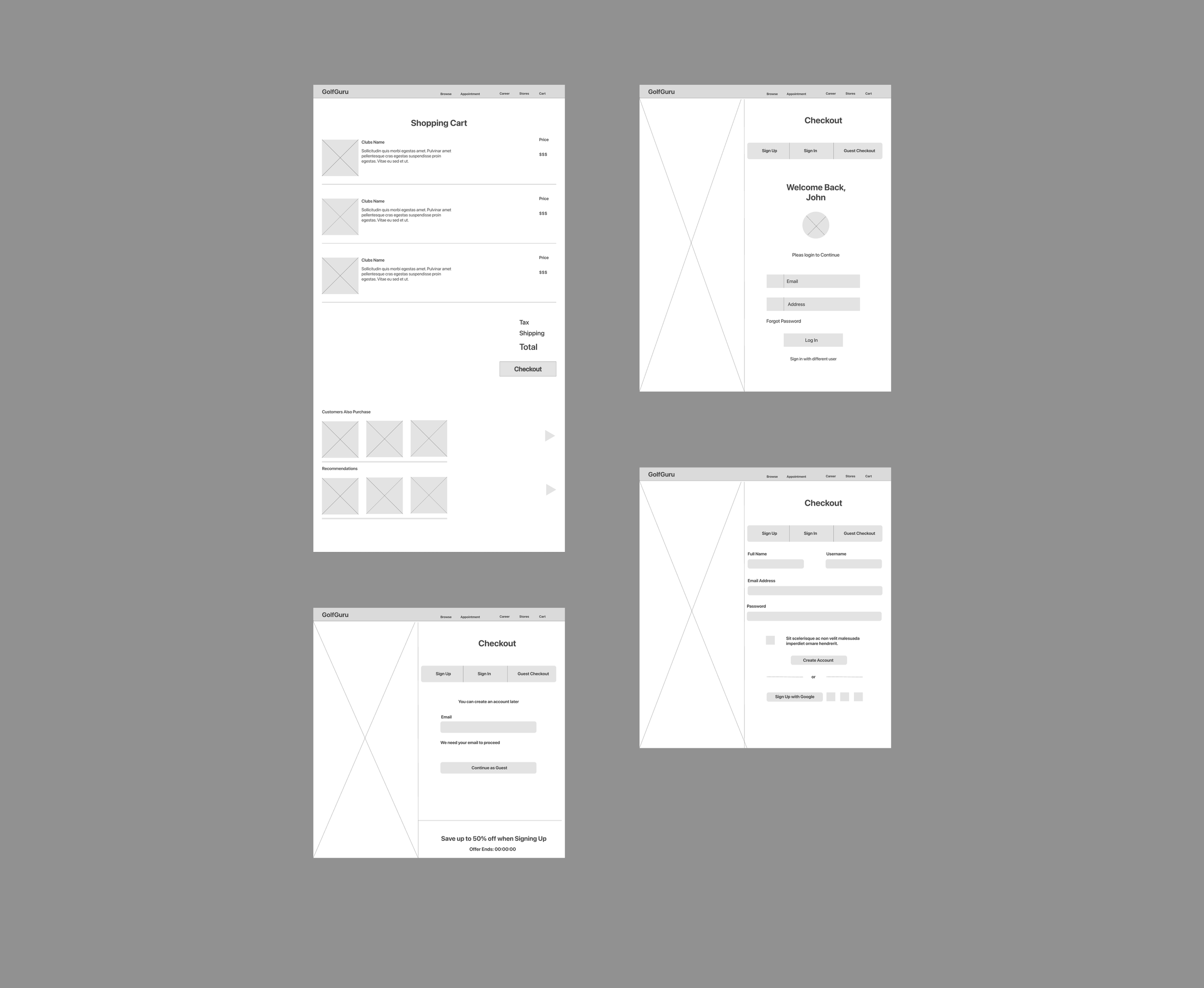
Shopping Cart
Standard Design
Description
Price
Total
Recommended Products
Purpose: To increase chance of sale
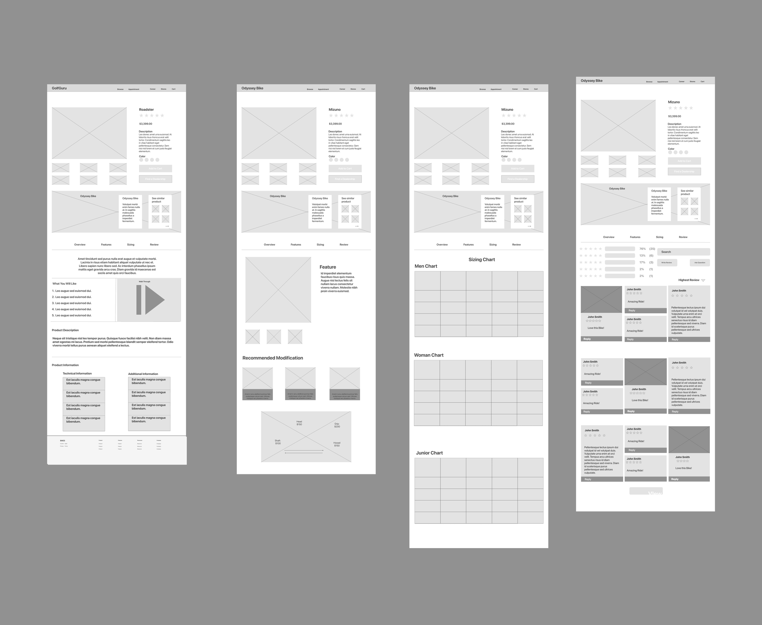
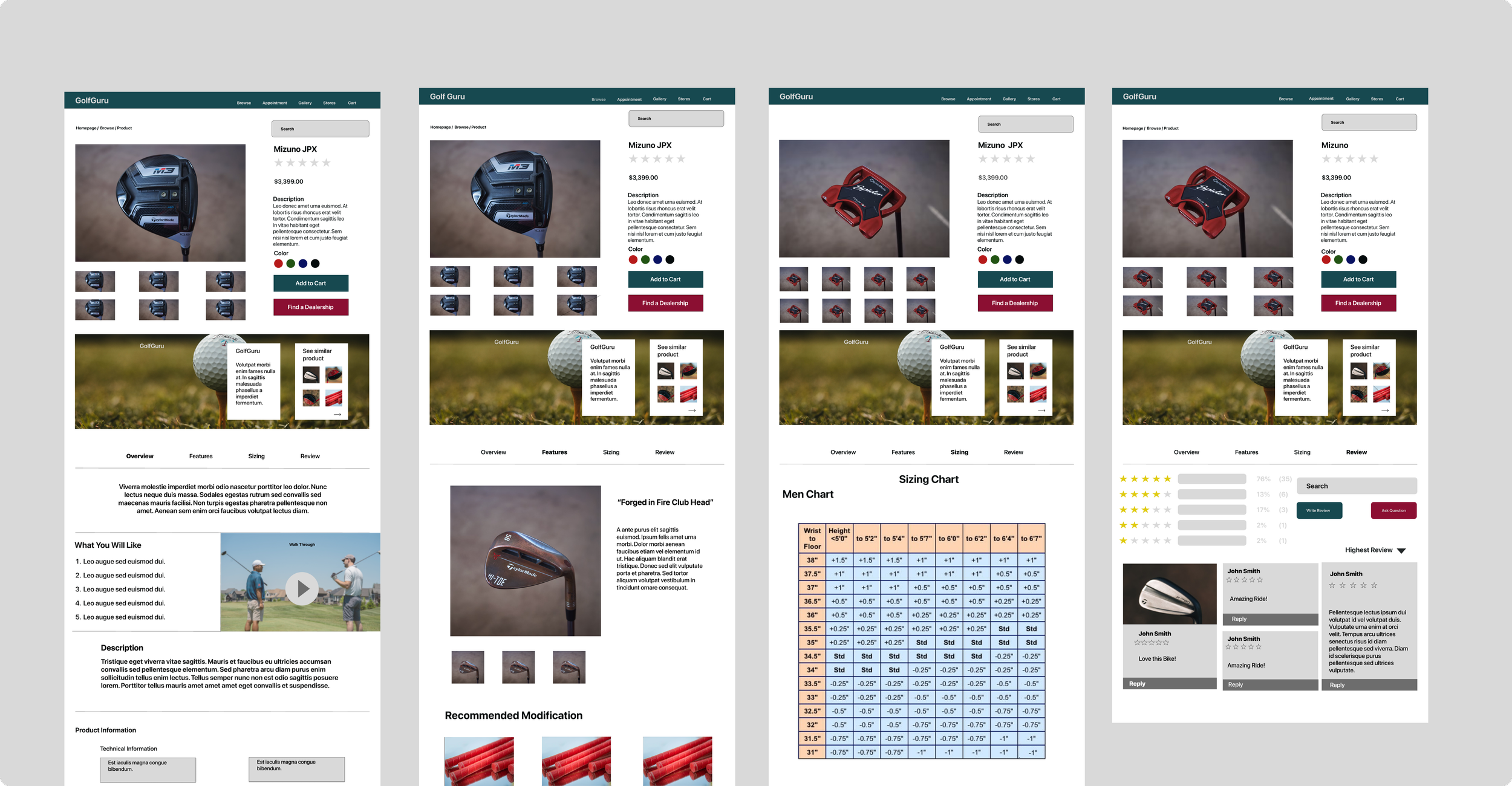
Product Page
Shopping Cart & Checkout
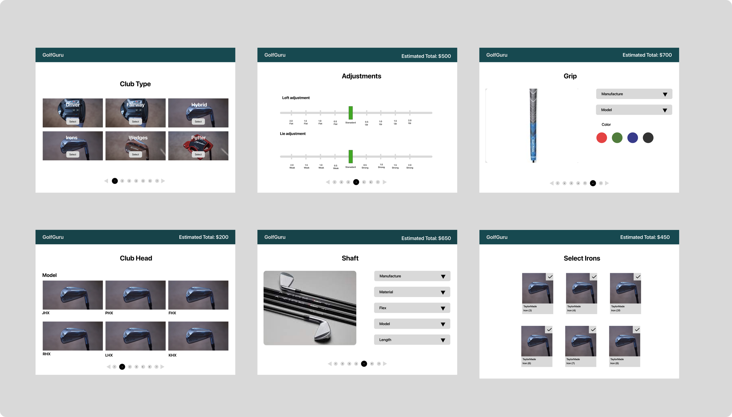
Personalize Page
Allow the user to feel “In Control.”
Influenced by TaylorMade
Step by Step journey of creating a club
Personalize Page
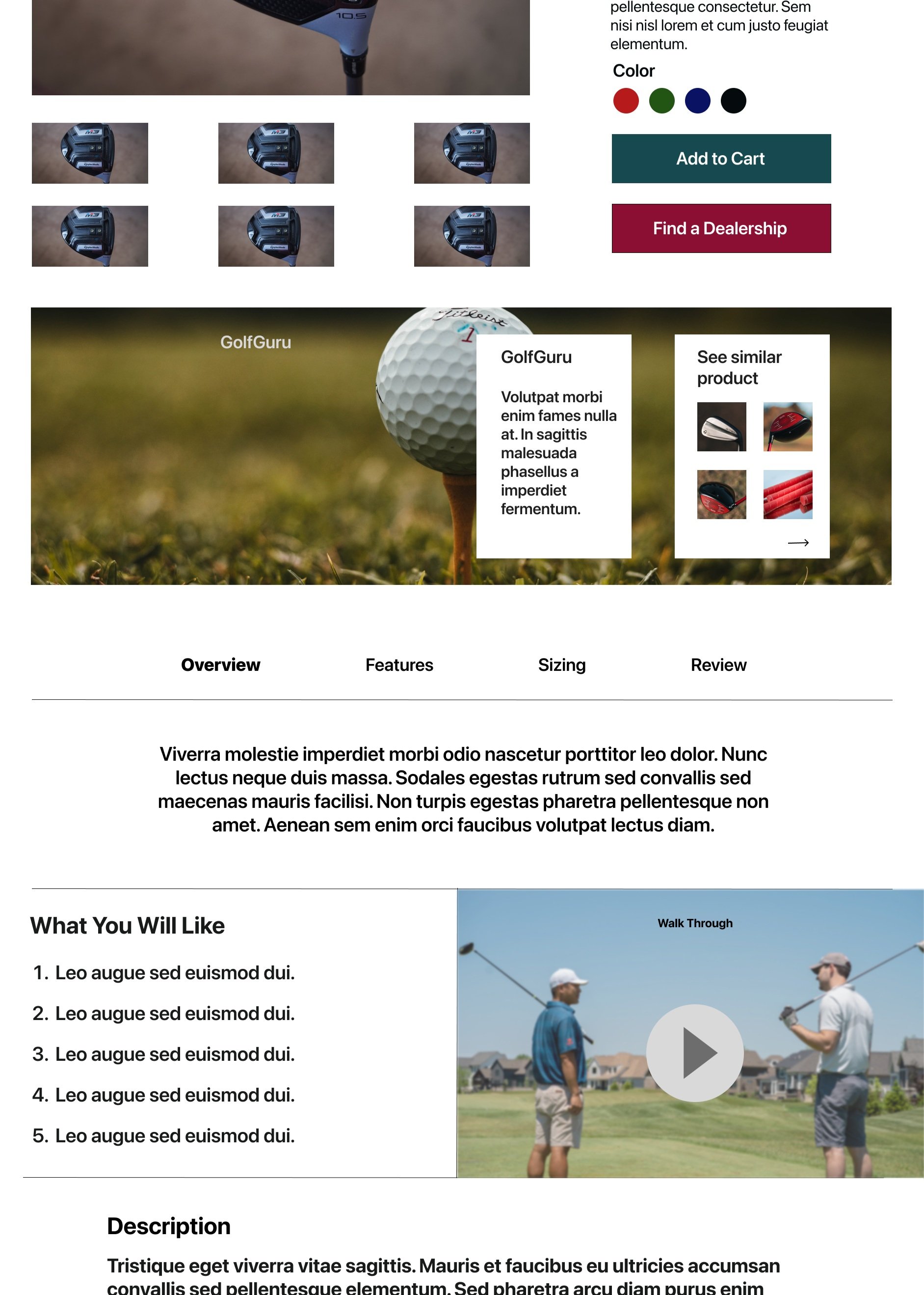
Product Page
Photo/Video/Description of product
CTA
Add to Cart & Find Dealer
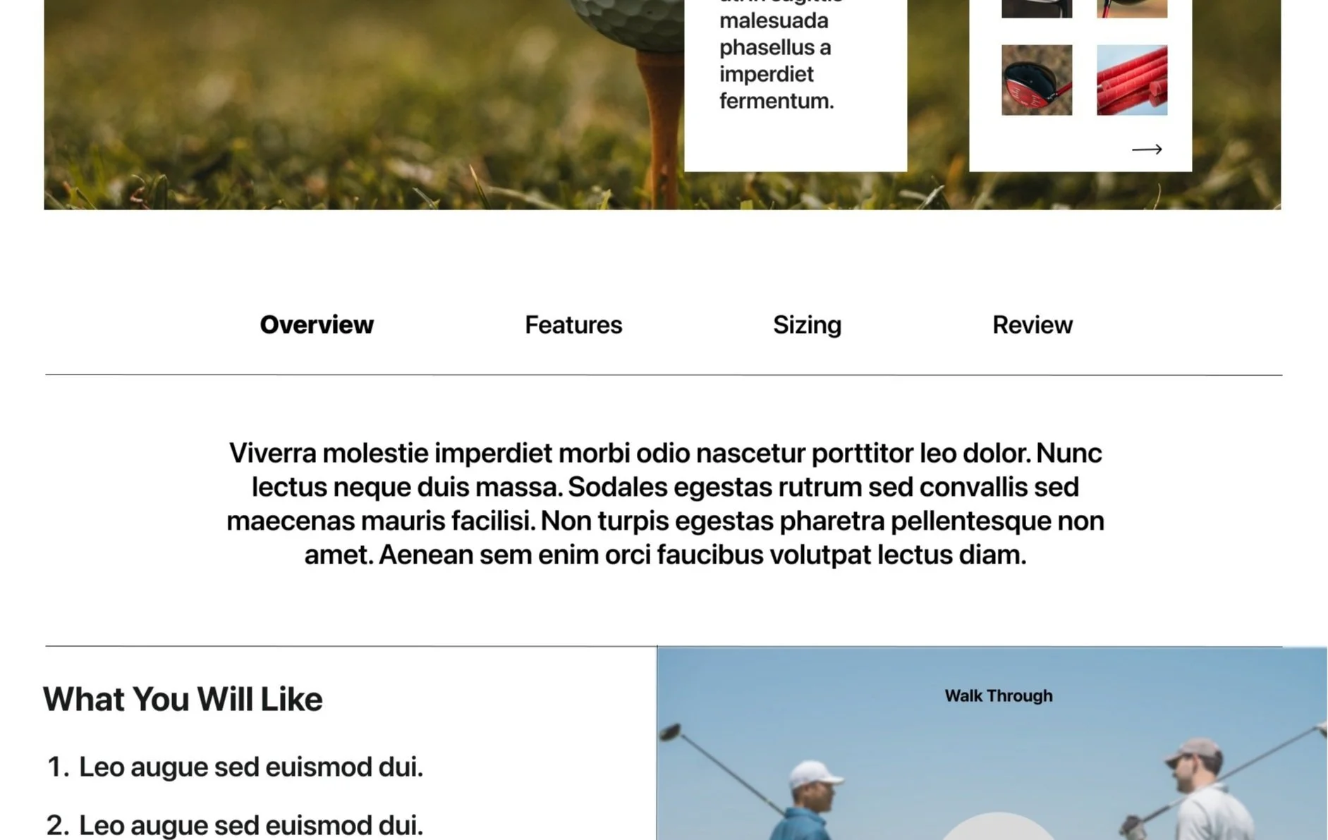
Information Users would like
Overview
Features
Sizing
Review
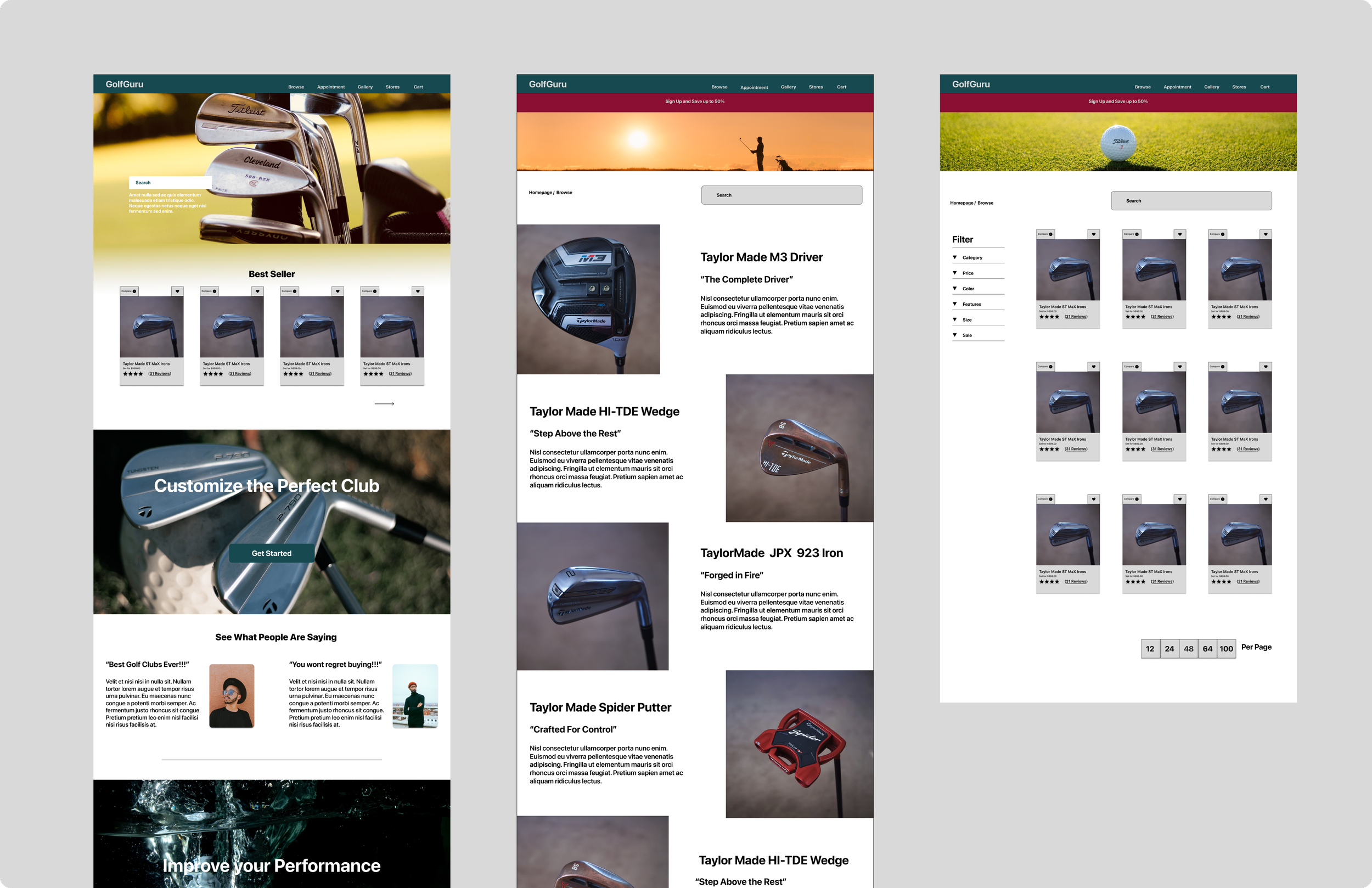
Home Page
Emphasizing the hierarchal order
Providing a CTA Button (Shop)
Displaying the best product Consumers would like
Based on Competitive Analysis
Incorporated a “personalized section.”
Establishing credibility
Adding testimonial Review
Usability Testing
Once a low fidelity wire frames were created, a first round of usability testing was conducted amongst 5 individuals who fit the criteria. That was accomplished to test the sucess of created userflows. Below are 3 different userflows that were tested.
User were asked to see them as a customer who wants to purchase a product from the website
Task:
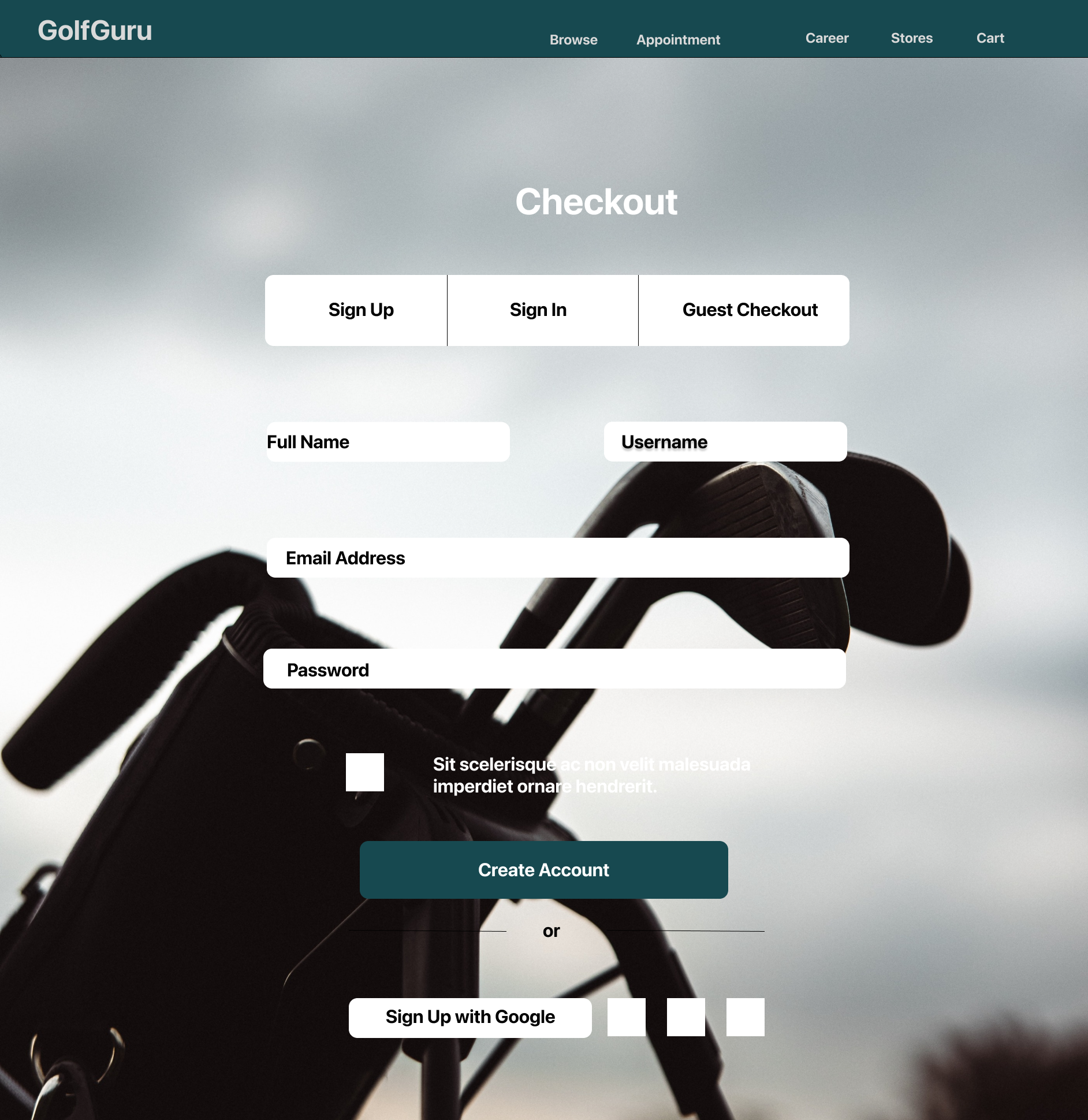
You noticed that if you sign up to be a member, you will save when checking out. You will have just enough money if you sign up. Find both ways you can sign up to become a new company member.
Passed
Sign in/ Sign up/ guest screen
2. Users were asked to find and comment on the review section.
Task:
You are a person who heavily relies on reviews and posts before you purchase an item online. Find the review section for a driver club and either reply to a post or write a review.
Passed
Sizing Section
Review Section
3. Users were asked to locate a section that provided information about their specific size for clubs.
Task:
You went to a few online stores and still need to determine the size of the clubs that fit you. You want a broad idea of your measurements of the clubs you need to play. Find the proper measurements for a set of iron clubs
Failed
Reiteration and Redesign
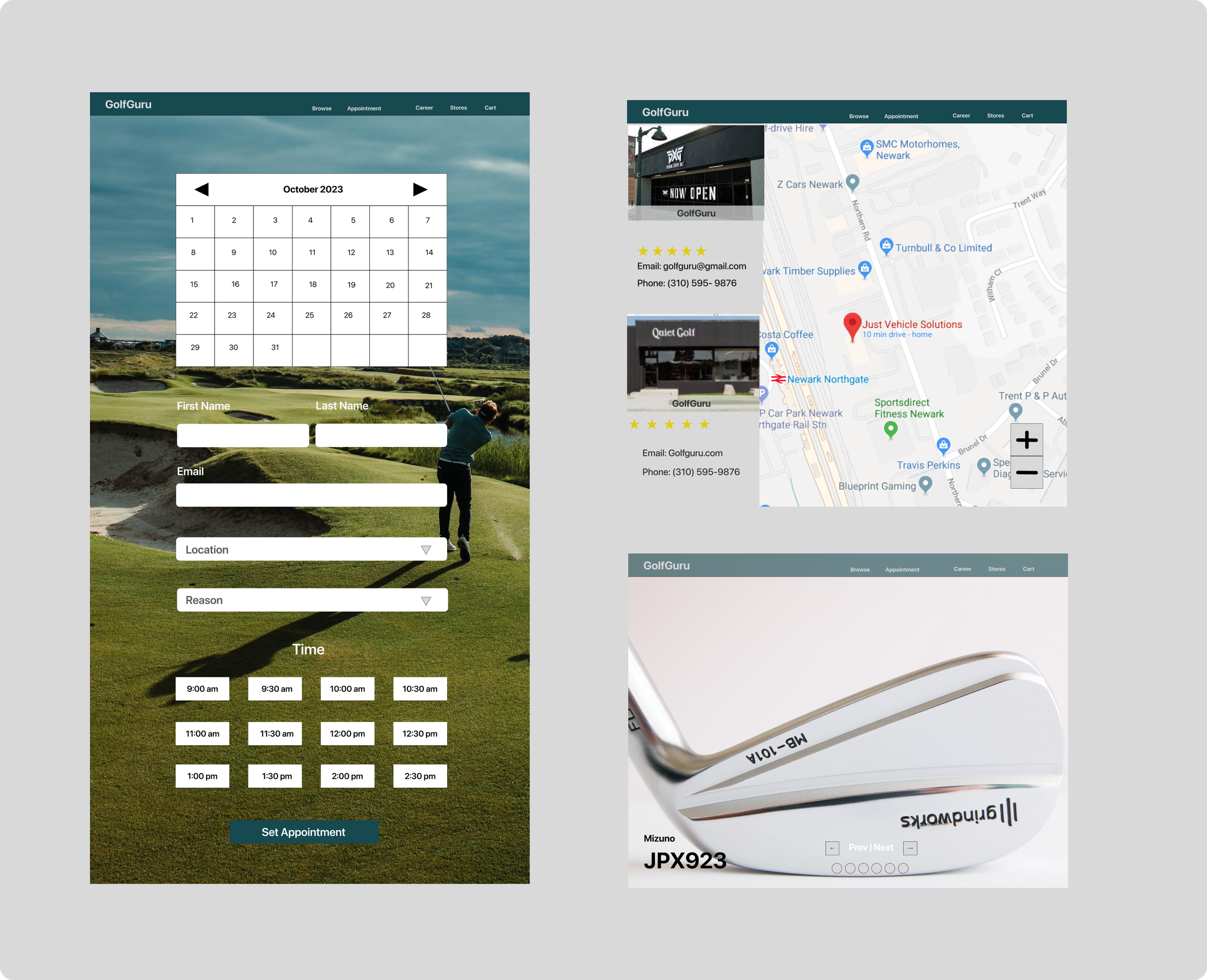
Store Location
Showing the brick-mortar location provides the user with another option of where to purchase a product. Increases the credibility.
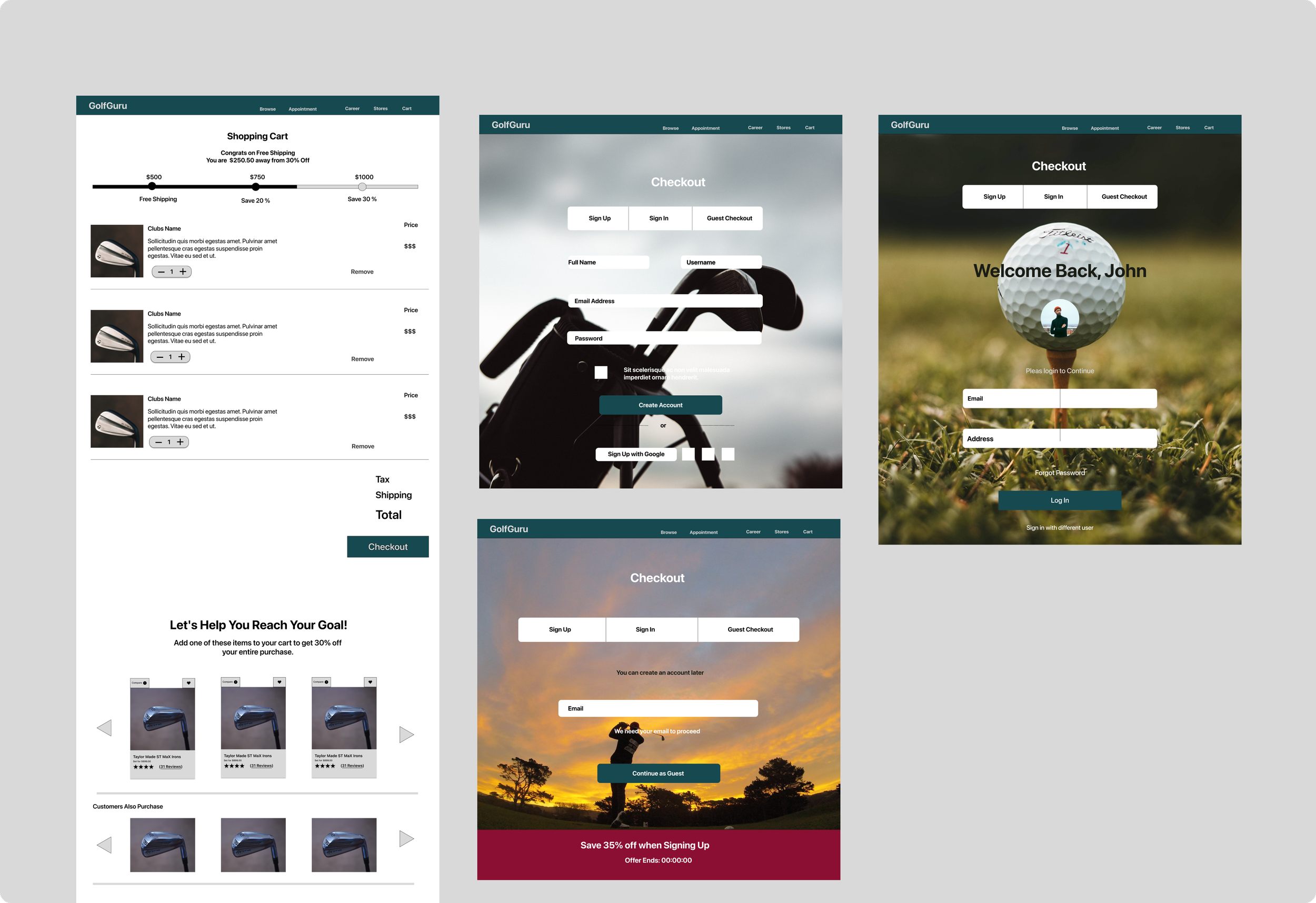
Spending Bar
Adding a spending bar will gamify the experience. This hooks the user to spend more with the idea of saving more money on their overall purchase. Provides another saving option .
Other iterations:
Implementing an appointment screen
Addresses users who are uncertain about their size
Less review to not overwhelm the users
Other Redesign:
Rephrasing CTA buttons
“Customize” to “Find the Right Club.”
Changing color scheme
Gallery
Implementing a gallery section provides users with more professional pictures increasing brand credibility
High Fidelity WireFrames
Home/Browse Page
Product Page
Appointment/Gallery/Store Page
Personalize Page
Shopping Cart/Sign up/ Checkout Page
Reflection
Before the start of the project, I already had preconceptions of how to improve an online product. It was not until I started interviewing participants that I realized there were other components I overlooked that many feel a product should have. The more I conducted a usability test, the more I could see the pain points users had and where my product struggled during the experience. Some issues, such as color and word choices, were easy to fix. Along with this challenge came helpful insight from the participants to improve my products. For example, a suggestion of adding the store location and fitting appointment are both crucial in enticing an individual to purchase. Emphasizing the research, the customer wants a stress-free experience. They want an experience that gives them the ability to access the right information in a few clicks away. Ultimately they want to feel confident with their purchase.
