Recover Vibe
Overview
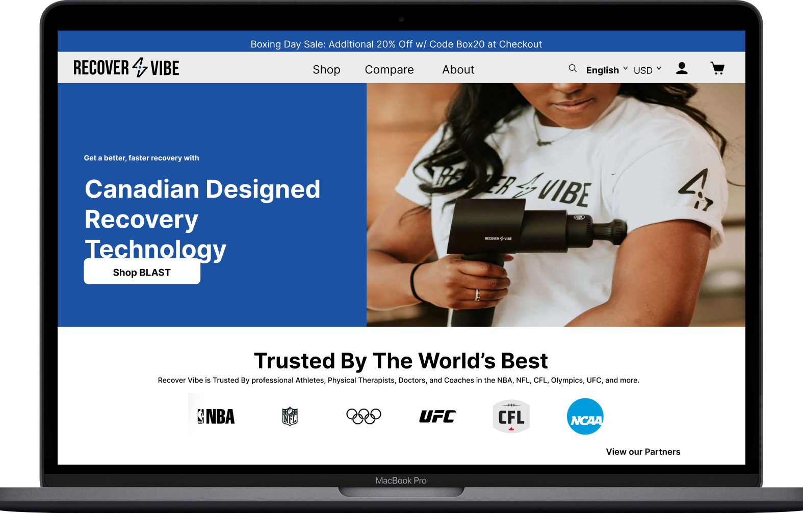
This case study focuses on a company called Recover Vibe. This specific company specializes in providing affordable and effective products that enhance Muscle Recovery.
Problem
The company is experiencing a Low Conversion Rate with sales due to the current state of the product’s design.
Solution
Improve the current state of the product by Redesigning the home page, shop page, and compare page. Providing deliverables such as:
Personas
Usability Test
Low-Fidelity Wire-Frame
High Fidelity Wire-frame
Goals
Improve Conversion rate
Educate/inform users in a seamless
Establish brand loyalty
Improve brand credibility
Highlight Specific product (Recover Vibe Mini)
Decrease bounce rate
Research:
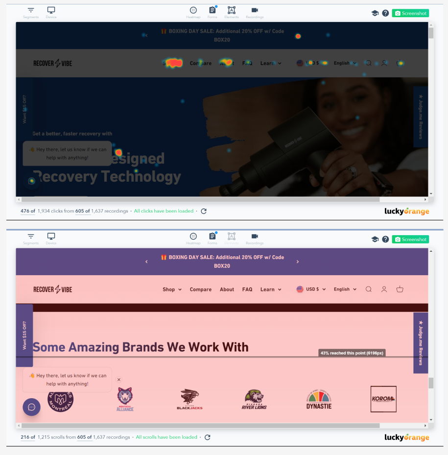
Heat Maps & Screen Recording
Users interact with the “Store Button” the most
Heat Map
Helped identify which sections were clicked the most. There is a significant drop-off in users the closer we get to the bottom of the page.
96 percent reach Recover Vibe Blast massage gun
65 percent reach recover VIbe Mini Massage gun
58 percent reach compare section
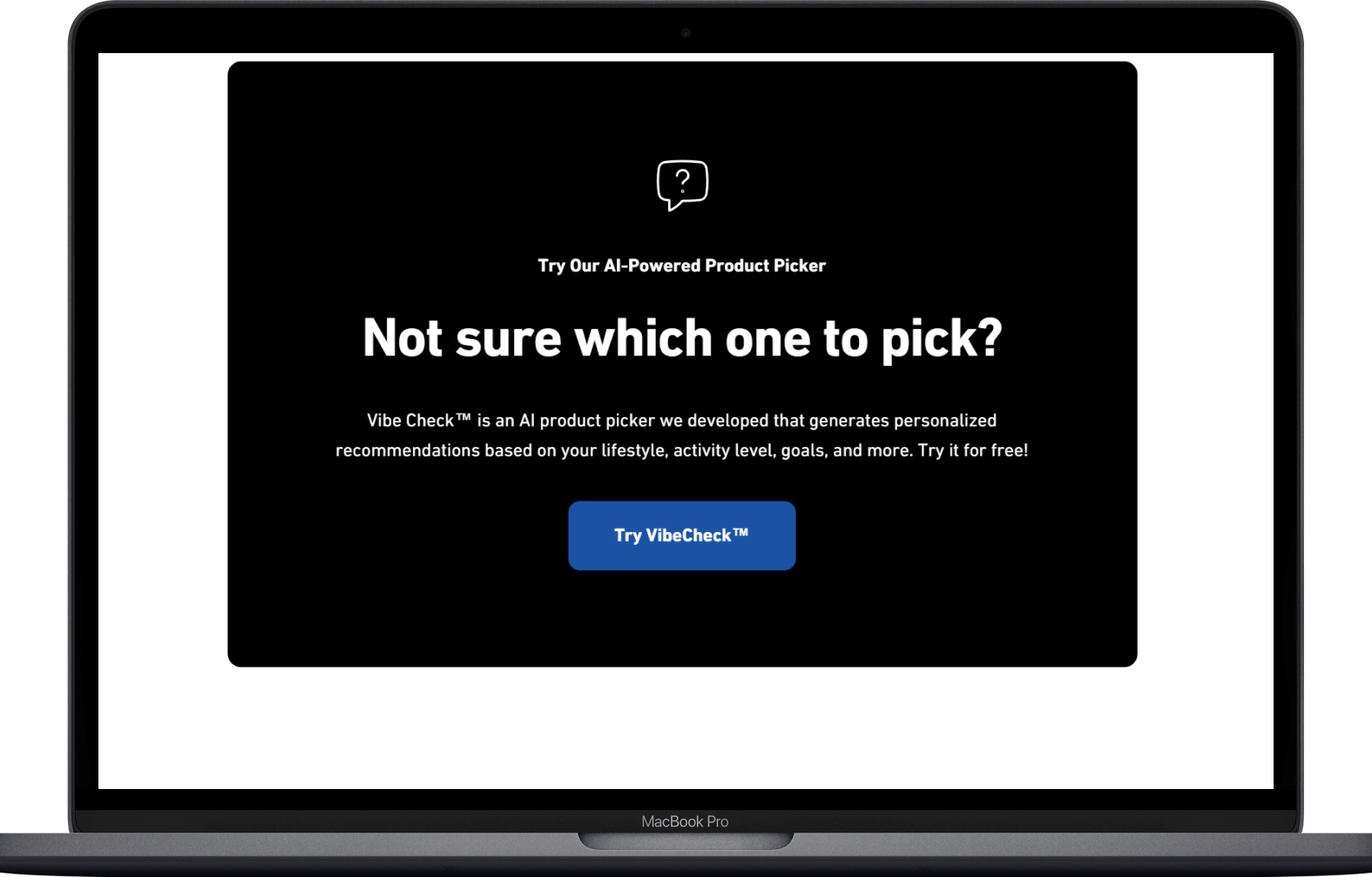
42 percent reach the product picker
35 percent reach reviews
25 percent reach value section
How are people interacting?
Screen Recordings show:
Clicking on the logo to navigate to the homepage
Scrolling occurs more on shop or product pages rather than homepage
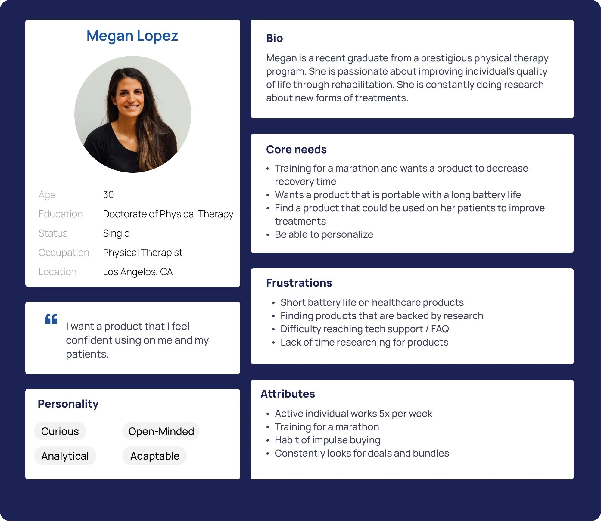
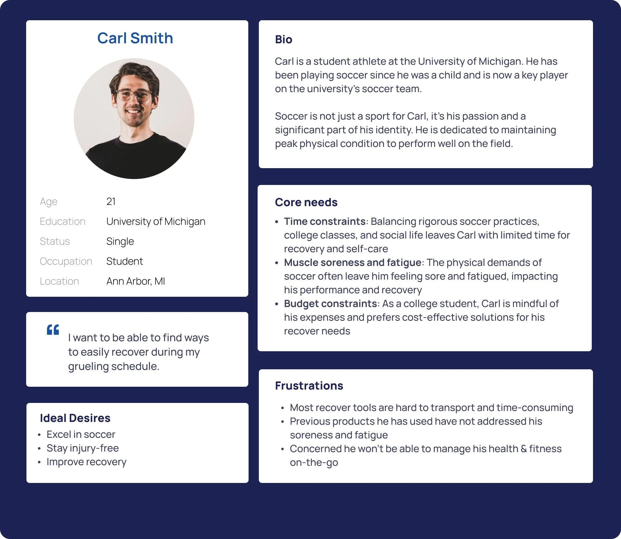
Personas
Why implement user Personas?
Information gathered from all the research allowed each team member to create a persona that reflects potential users. Providing personas allowed us to understand the user’s wants, needs, and fears better.
Potential Users look for :
“Cost Effective Product & Backed by Research”
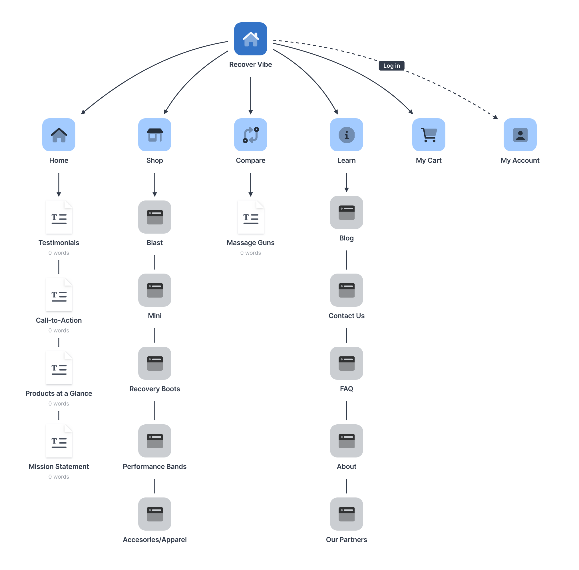
Site Maps
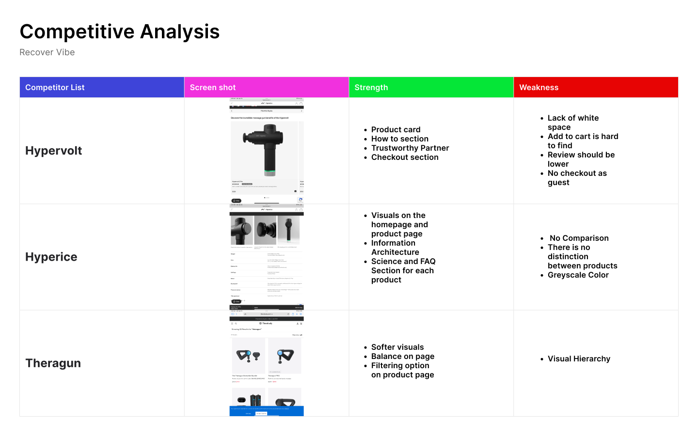
As a collective, we redesigned the structure in a way that did not deviate too far from the original design. This allowed us to emphasize important section such as the home page, shop page, and product page.
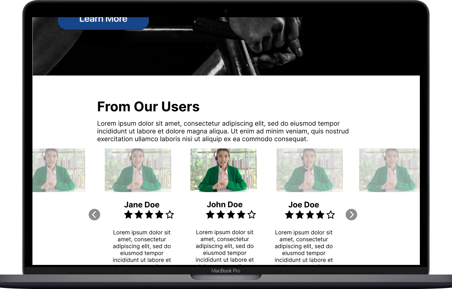
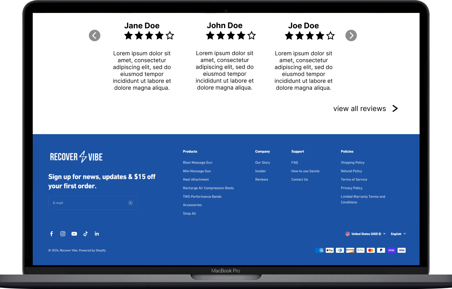
The stakeholder expressed that he wanted to keep a separate section for the compare page to show users how the match up to the competitor. Along with this idea, the stakeholders wanted to emphasize testimonial reviews.
Understanding the Stakeholder
Conservative with Subtle Changes
Usability Testing
Tasks/Reports (Pic)
Six Usability Test = “Sweet Spot”
Due to time constraints, we did not incorporate a way to filter out the ideal consumer.
A survey should have administered to help find the consumer who will contribute a lot to the research
Overview
Solution: Collaborate more and create one design as a team instead of separate ones
Task
Participants did not care much about testimonials unless they were from individuals with status.
Design a way to streamline the process of purchasing products.
Findings
Participants did not care much about testimonials unless they were from individuals with status.
Design a way to streamline the process of purchasing products.
Each member conducted two different usability tests (Total of 6 test)
Challenges: Lack of consistent findings
Reiterating/ Redesign
As a team, we made the necessary changes to improve the product based on the research completed and the stakeholders' clearance. Each member conducted their usability testing and made the changes needed on their respective page.
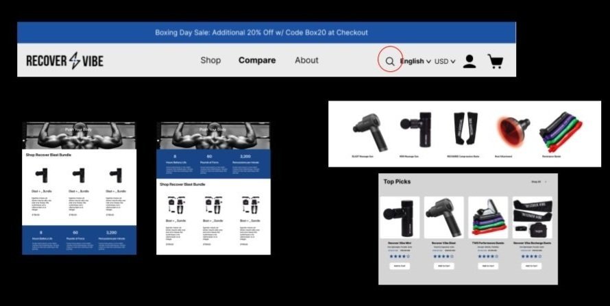
Navigation
Incorporating a search engine
Easier way to locate a product
“Although there is a limited amount of product to sort through, I would still want a way to look up a product if I knew what I wanted already.”
Incorporated on the homepage
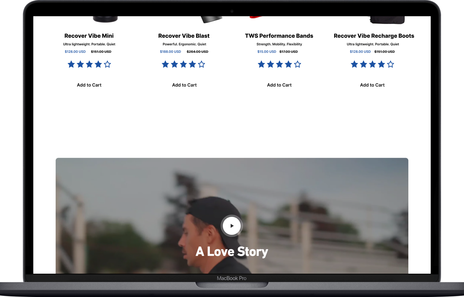
Displayed more information about products
Decrease the amount of time users “click through” a product
(Add to Cart) button streamlines the process
Product Card
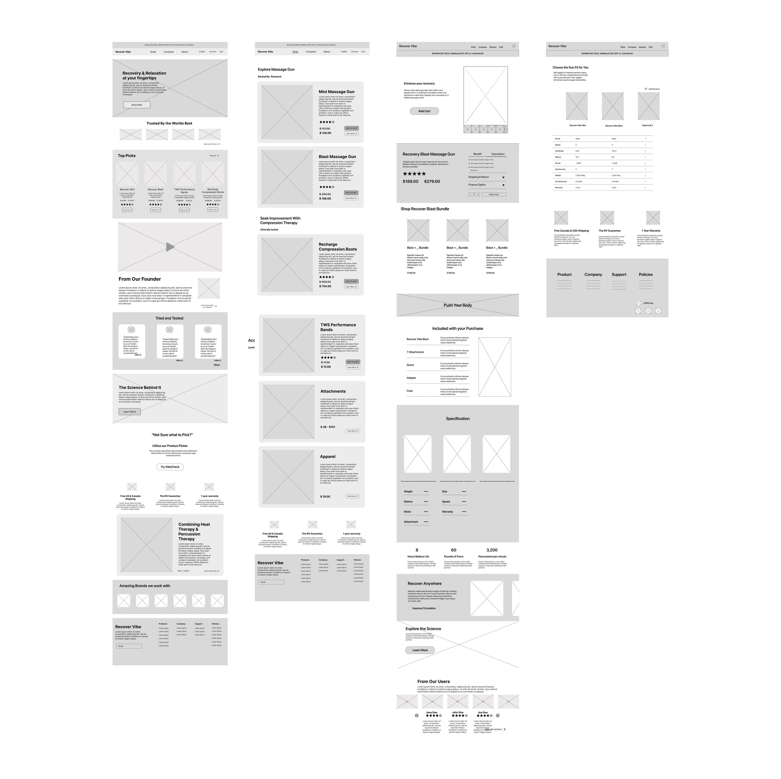
Rearrangement
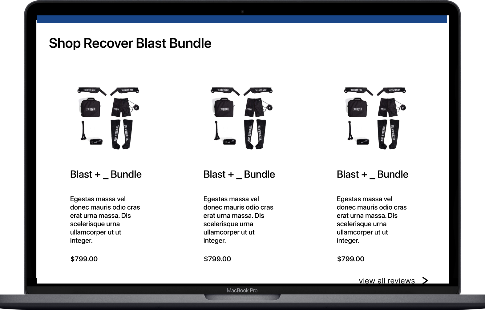
Initially, the bundle section was placed higher since stakeholders wanted to emphasize this section.
After user research and careful deliberation as a team, we persuaded the stakeholders to place the section lower.
Outcome: Improves the overall flow.
Low Fidelity Wire Frame
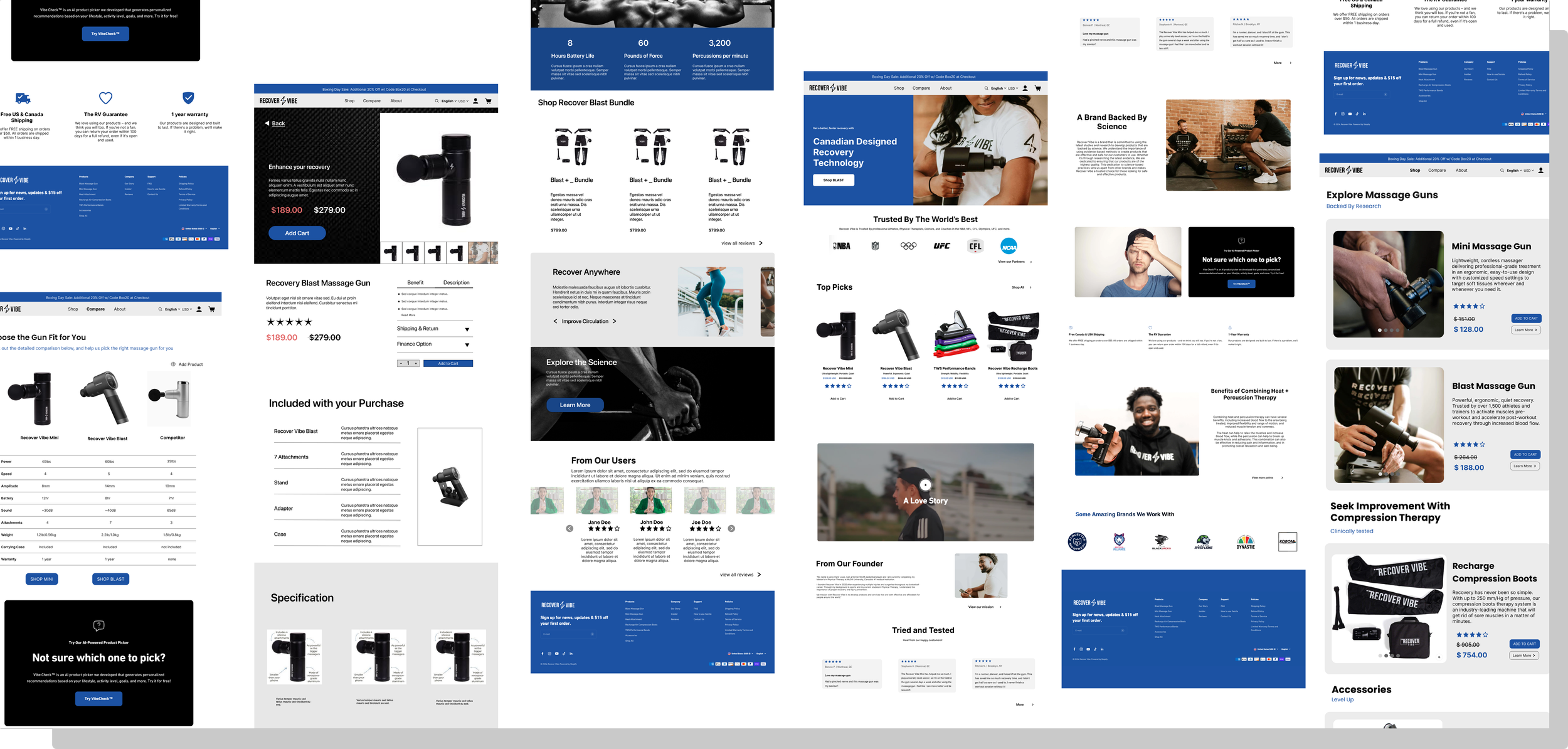
High Fidelity Wire Frames
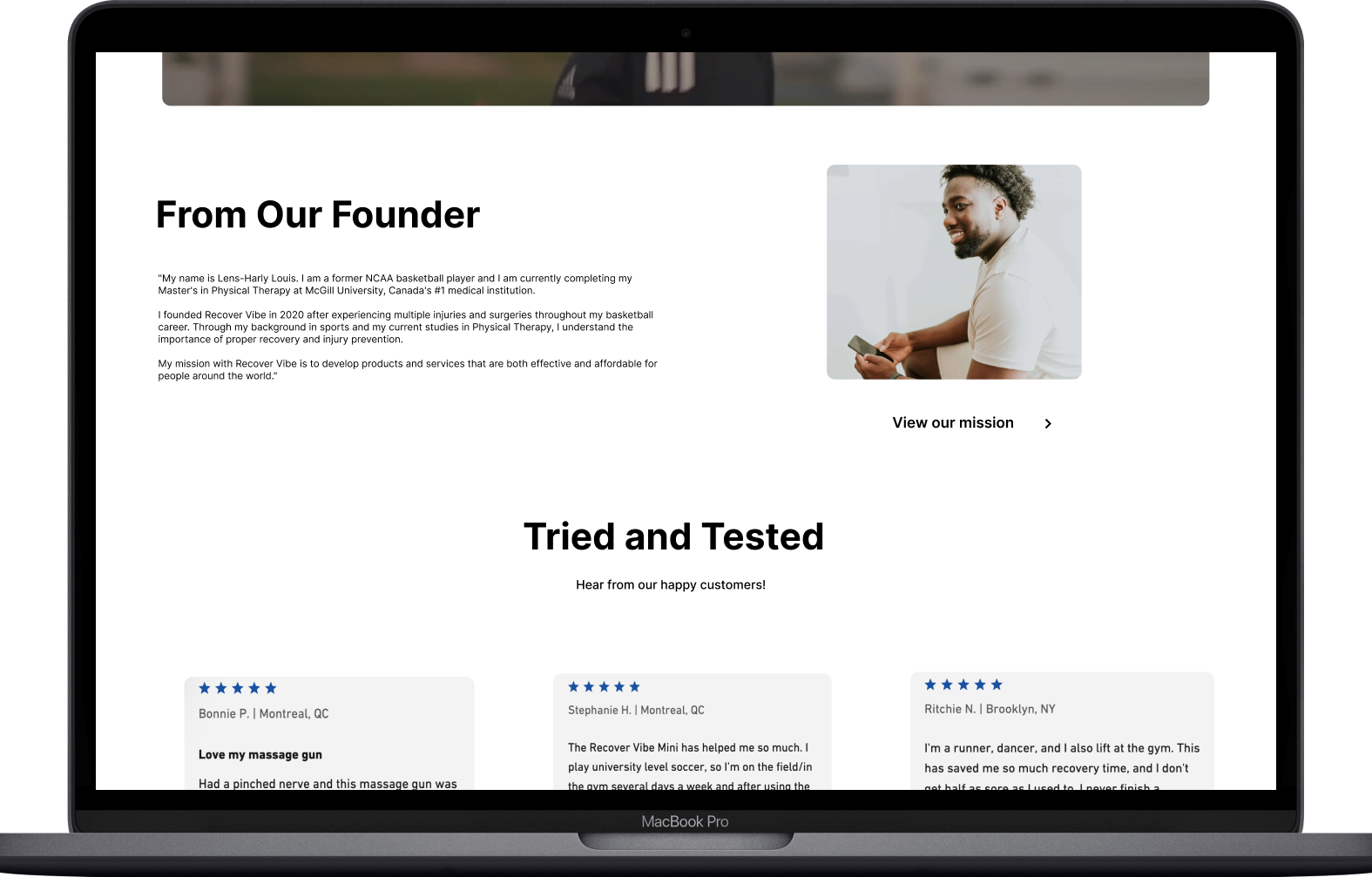
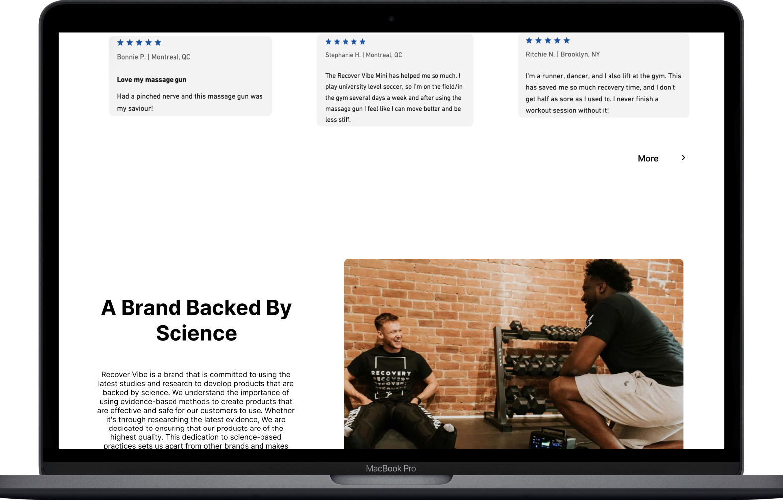
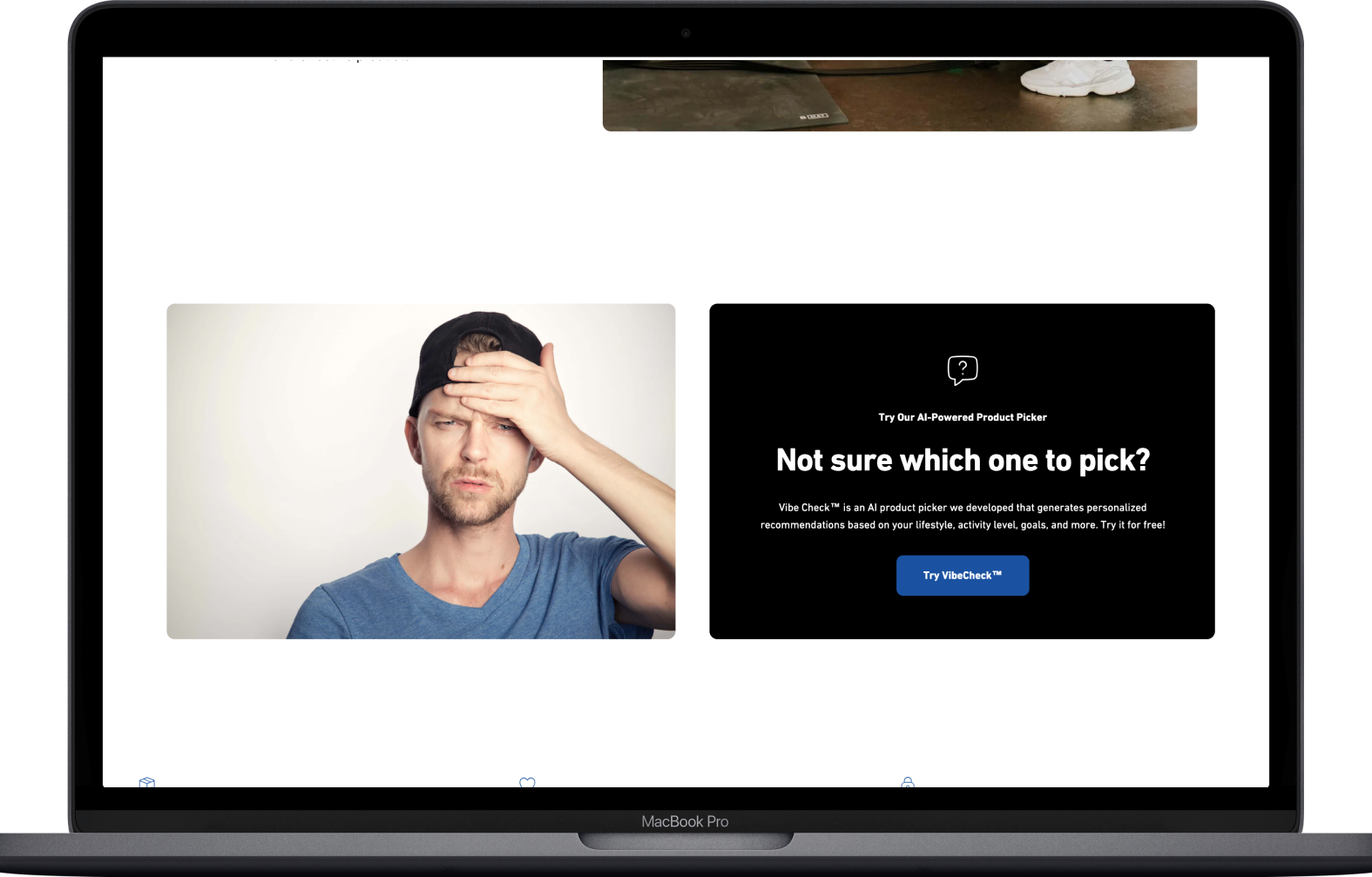
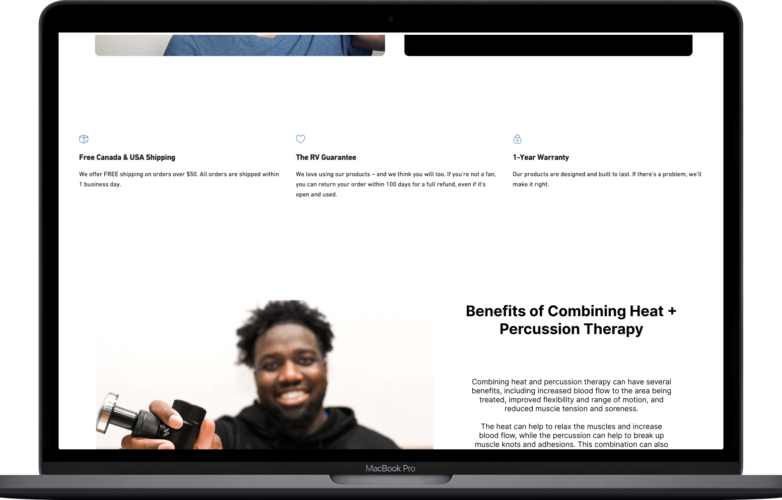
Although this was the last step of the process, I would have liked more time to test the redesigned product before publishing it online. I wanted to see if our changes impacted the user's overall experience. Below is our final High Fidelity Design.
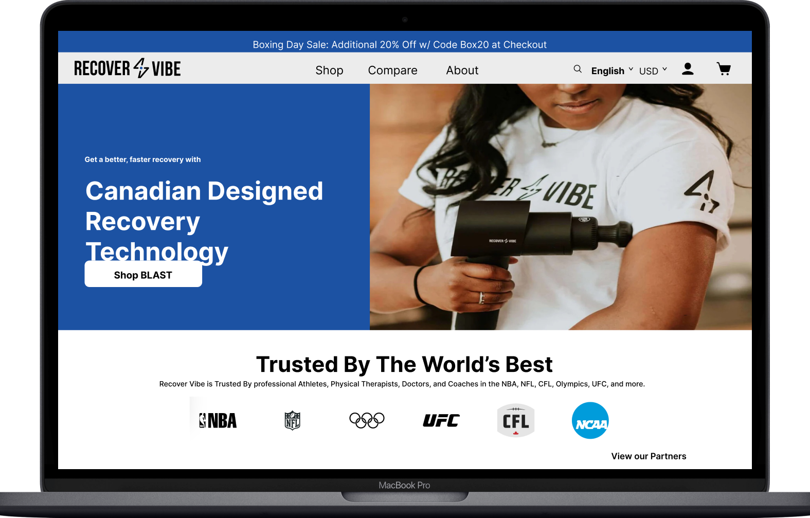
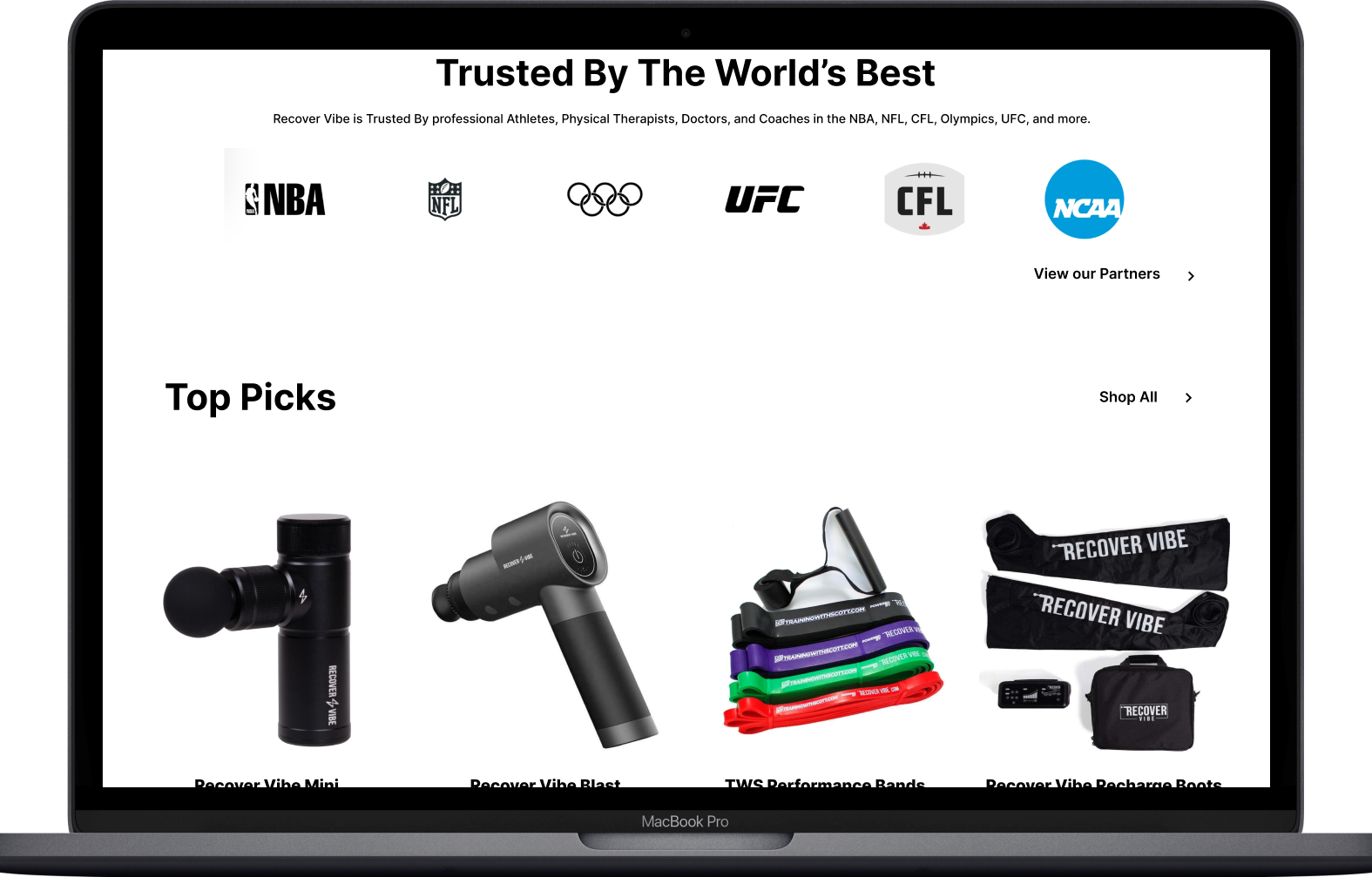
Home page:
Similar to the low-fidelity Wireframes. There were not a lot of changes in the design.
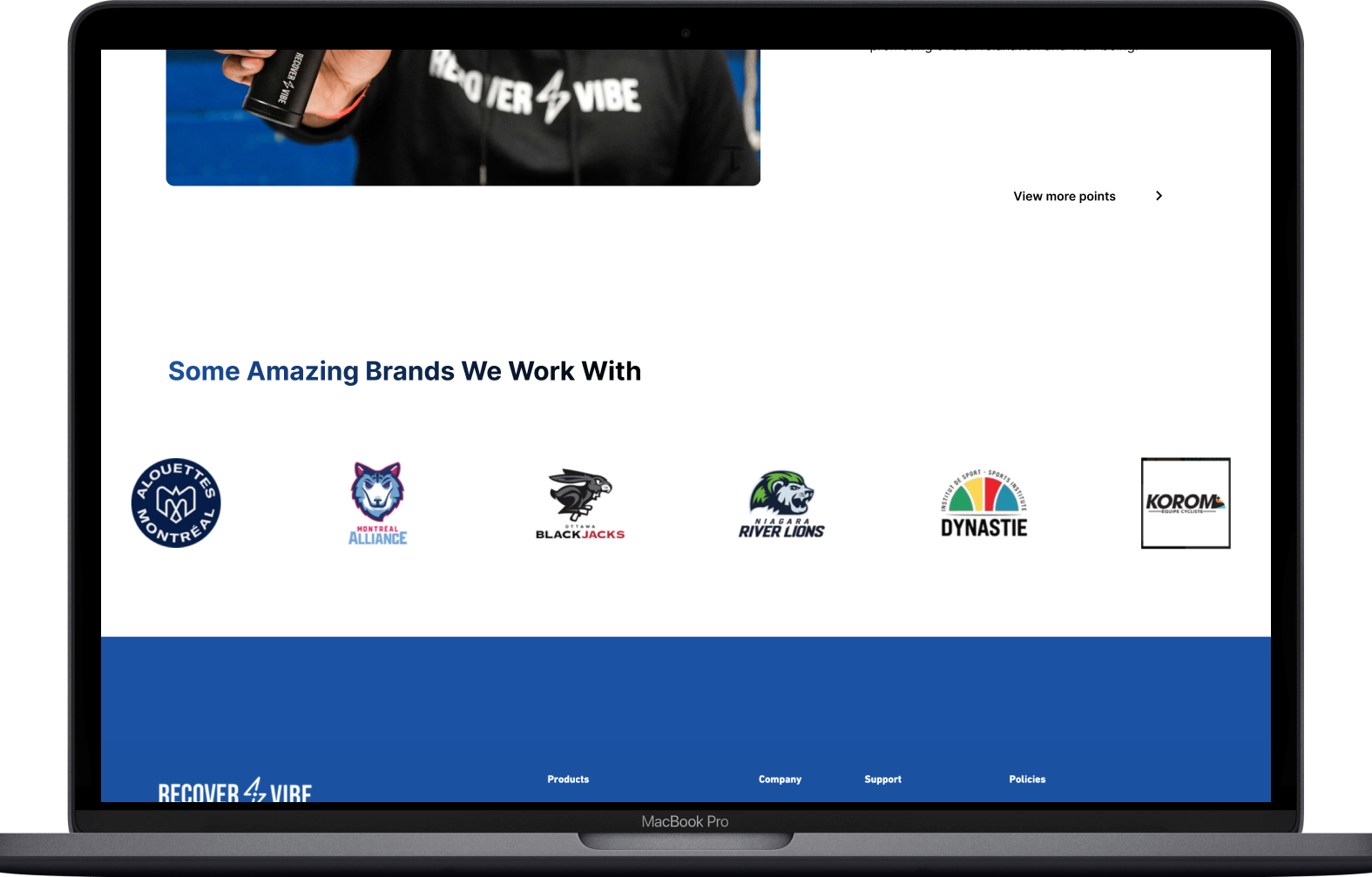
Incorporated both products and colors into the design.
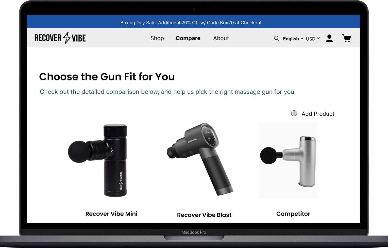
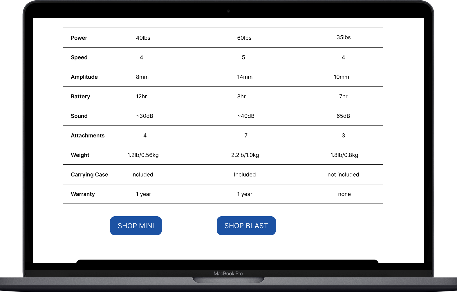
Compare Page:
Add a shop button at the bottom of the product.
Implementing this button gives users another way to access and purchase the product.
Keeping the name of the competitor vague.
Shop page:
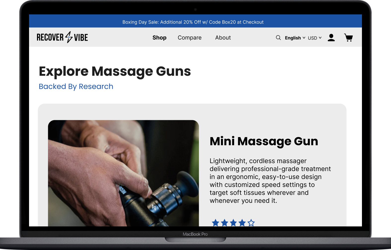
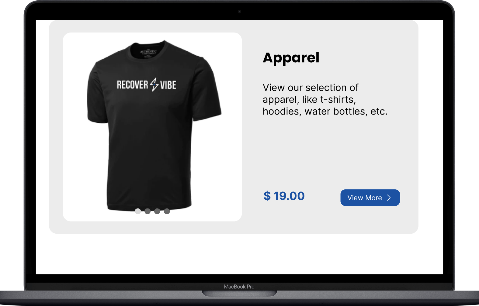
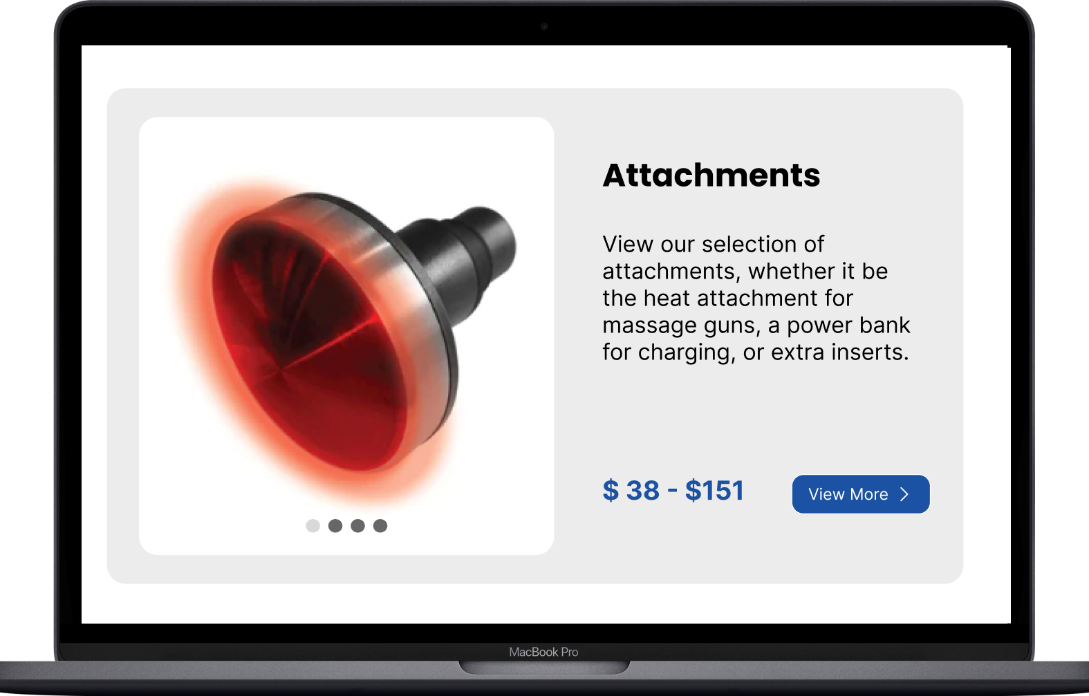
The product card has multiple photos presented in a gallery display
Purpose: To show users numerous product photos while in the browse mode.
Product Card:
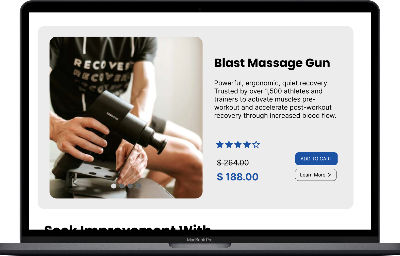
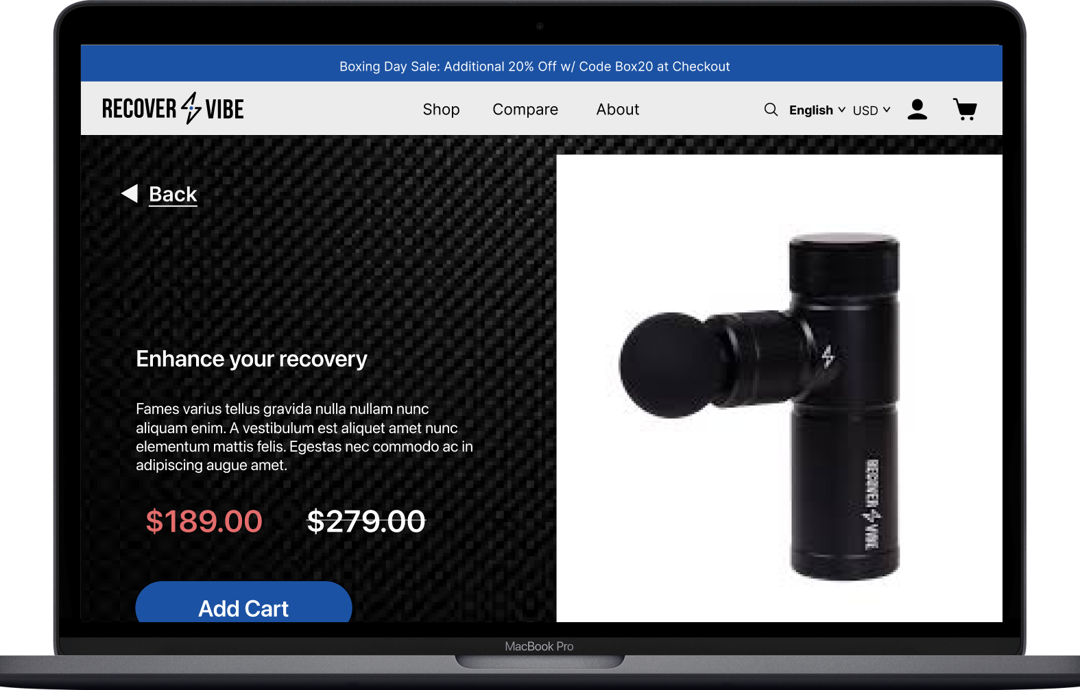
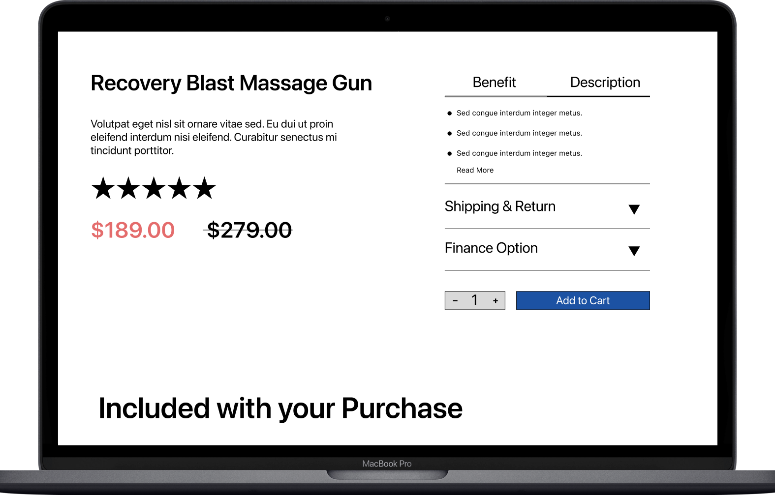
The hero screen iwas split with the left side showing the price and description, while the right were videos/pictures.
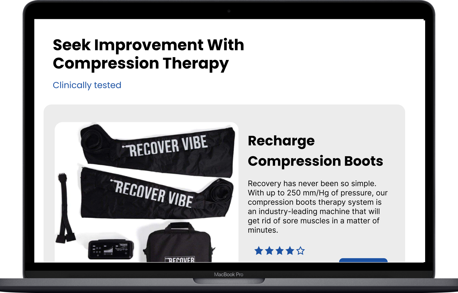
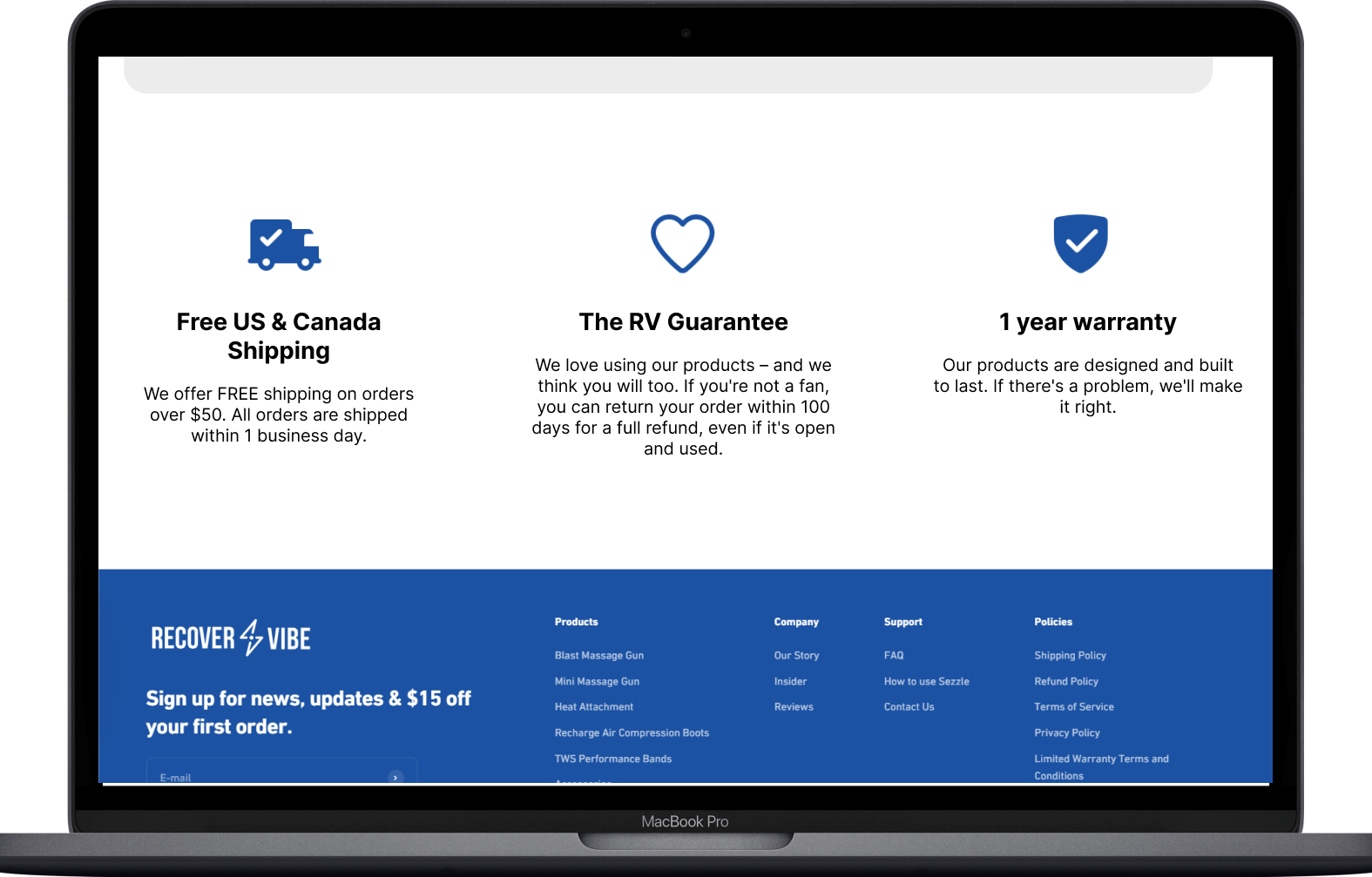
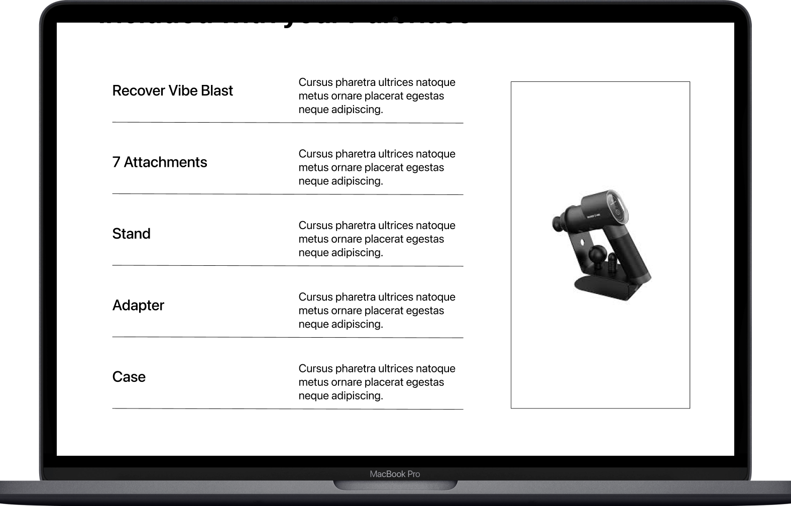
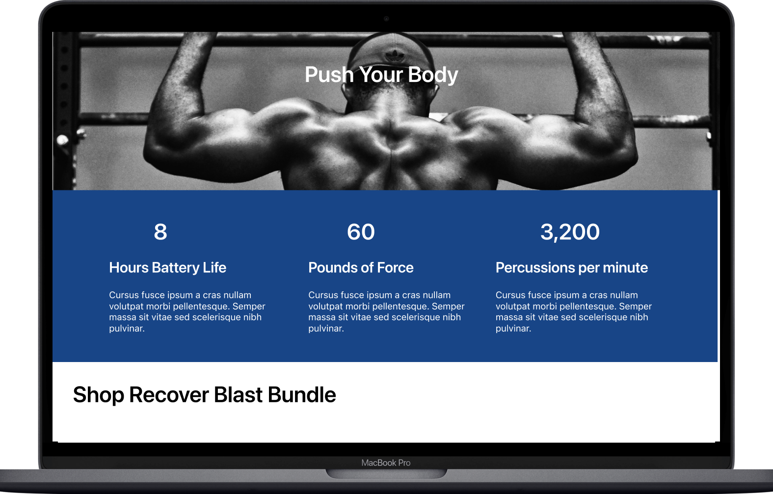
Users expressed bundles were located too high. They would’ve preferred if the info about the product had been located after the photos/videos. It was later relocated below the blue section that shows facts about the product.
Homepage
Shop Page
Prdocut Page
Compare Page
Interactive Prototype
Reflection
Working directly with a stakeholder was an exhilarating experience that brought real-world relevance to our project. Collaborating within a team environment allowed us to freely exchange ideas, significantly contributing to achieving our objectives. While we successfully completed the project, I recognized areas where we could have enhanced the final product. Improving communication and conducting additional rounds of testing are crucial steps that can potentially boost sales for the company. Despite these areas for improvement, I am proud of our team's accomplishments, given the tight timeline. Looking ahead, we then anticipated reconnecting with the stakeholder in a few weeks to assess how our final design impacts consumers.
